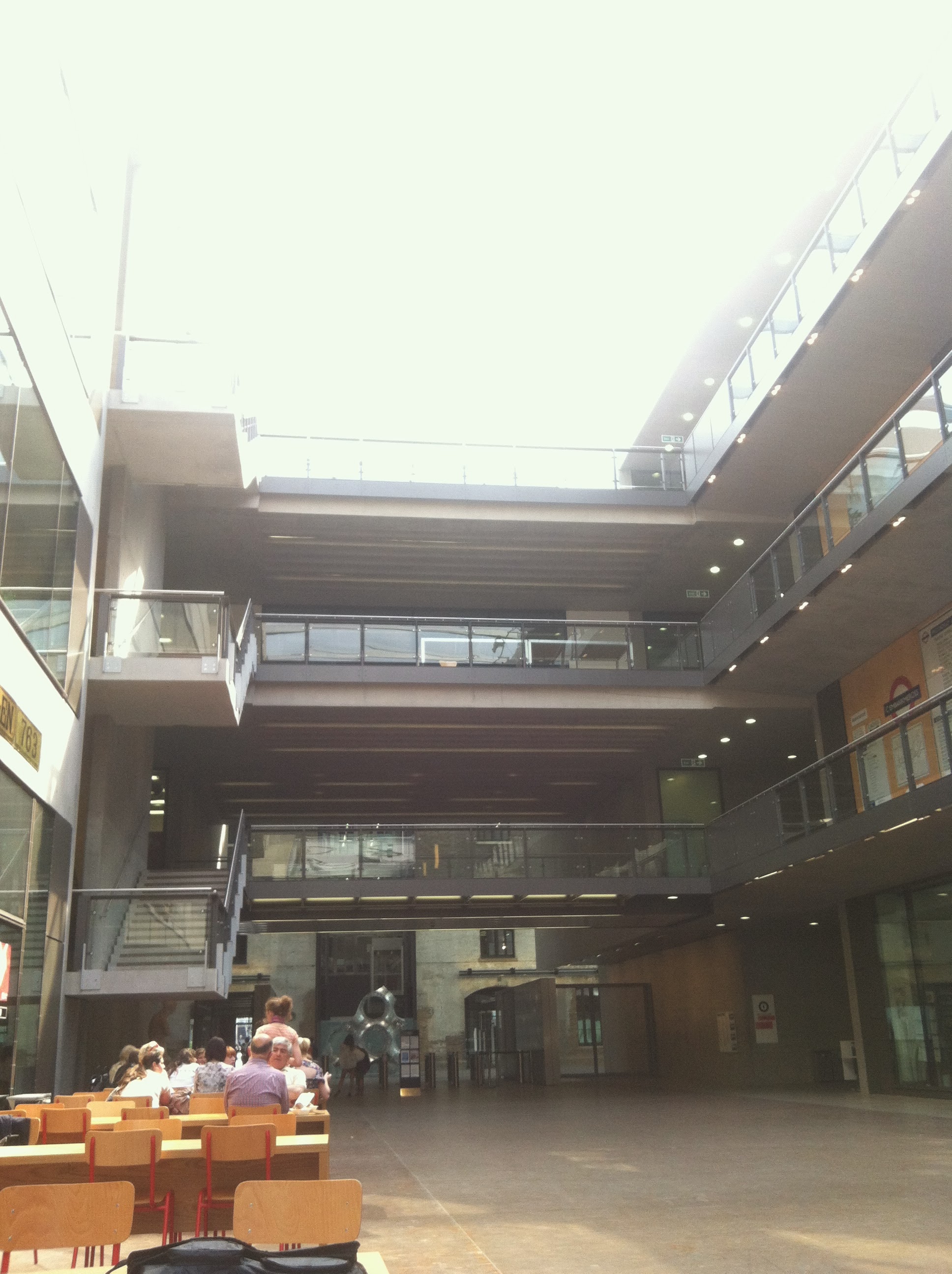
The summer before my senior year of college- after three years of advanced statistics and calculus and computer science and chemistry- I was desperate for a creative break. The desire to be surrounded by beautiful design and stimulated by the satisfaction of "making" something concrete drew me to Central Saint Martins.
I signed up for an interior design class and expected it to be simple- lining up couch and wall and curtain patterns to make a pretty picture- this it was not, and in the end I was very grateful. It was intense, interactive, and it brought us into London and out of our preconceived notions.
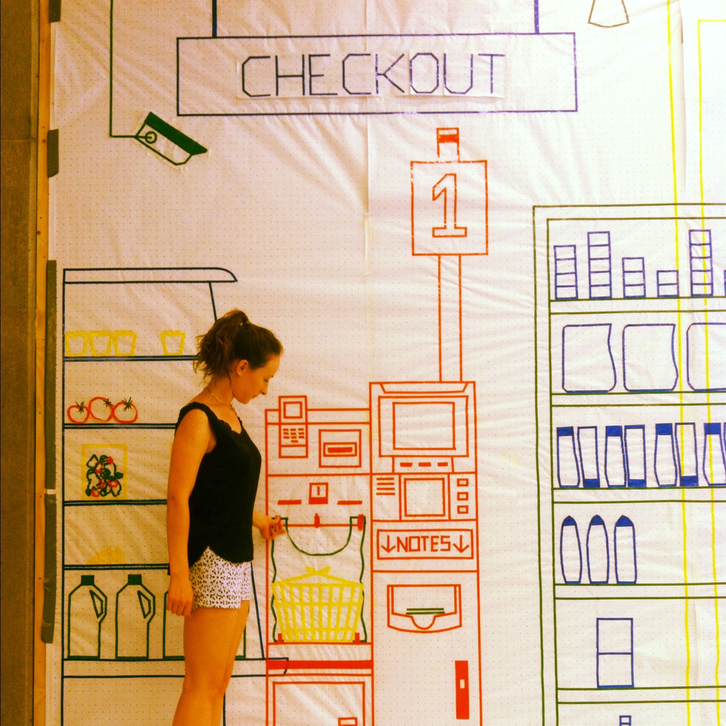
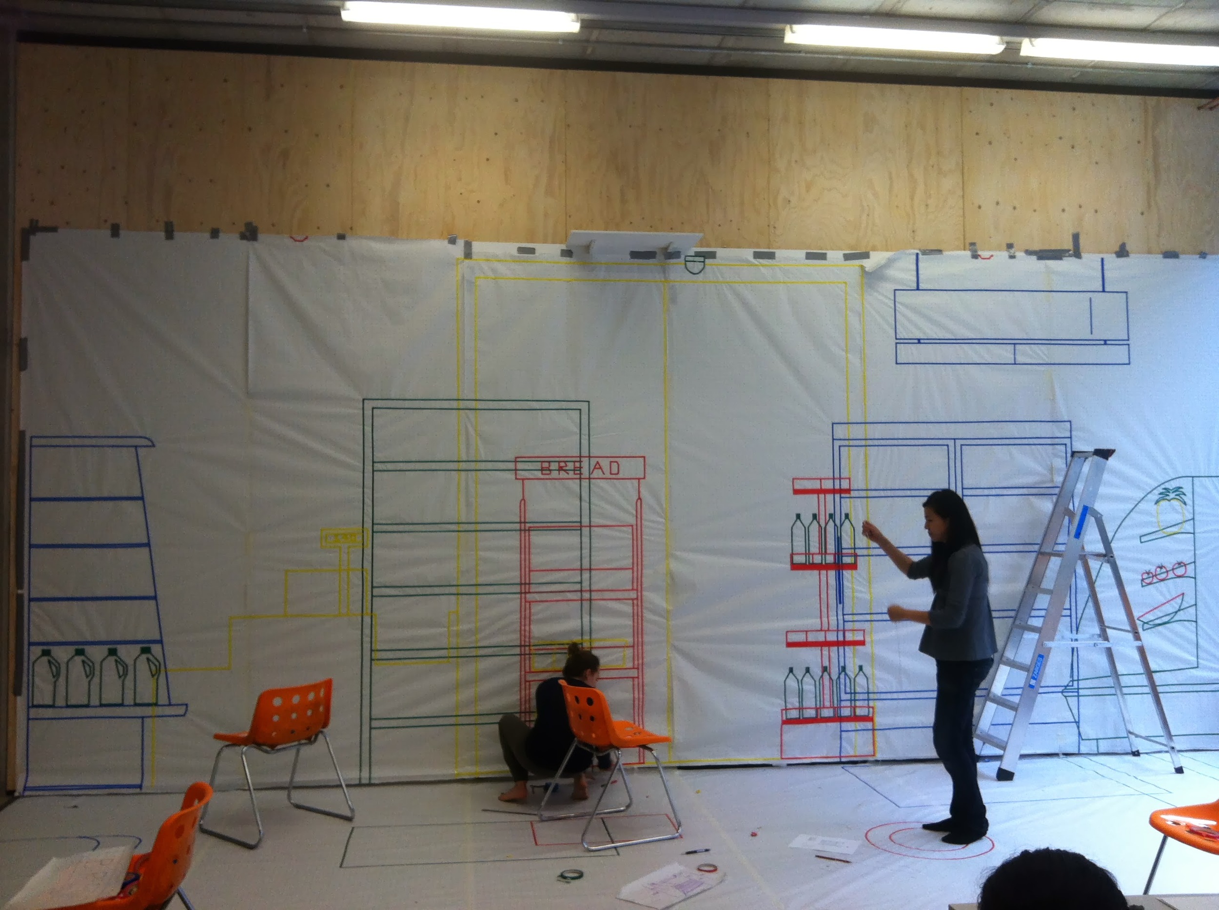
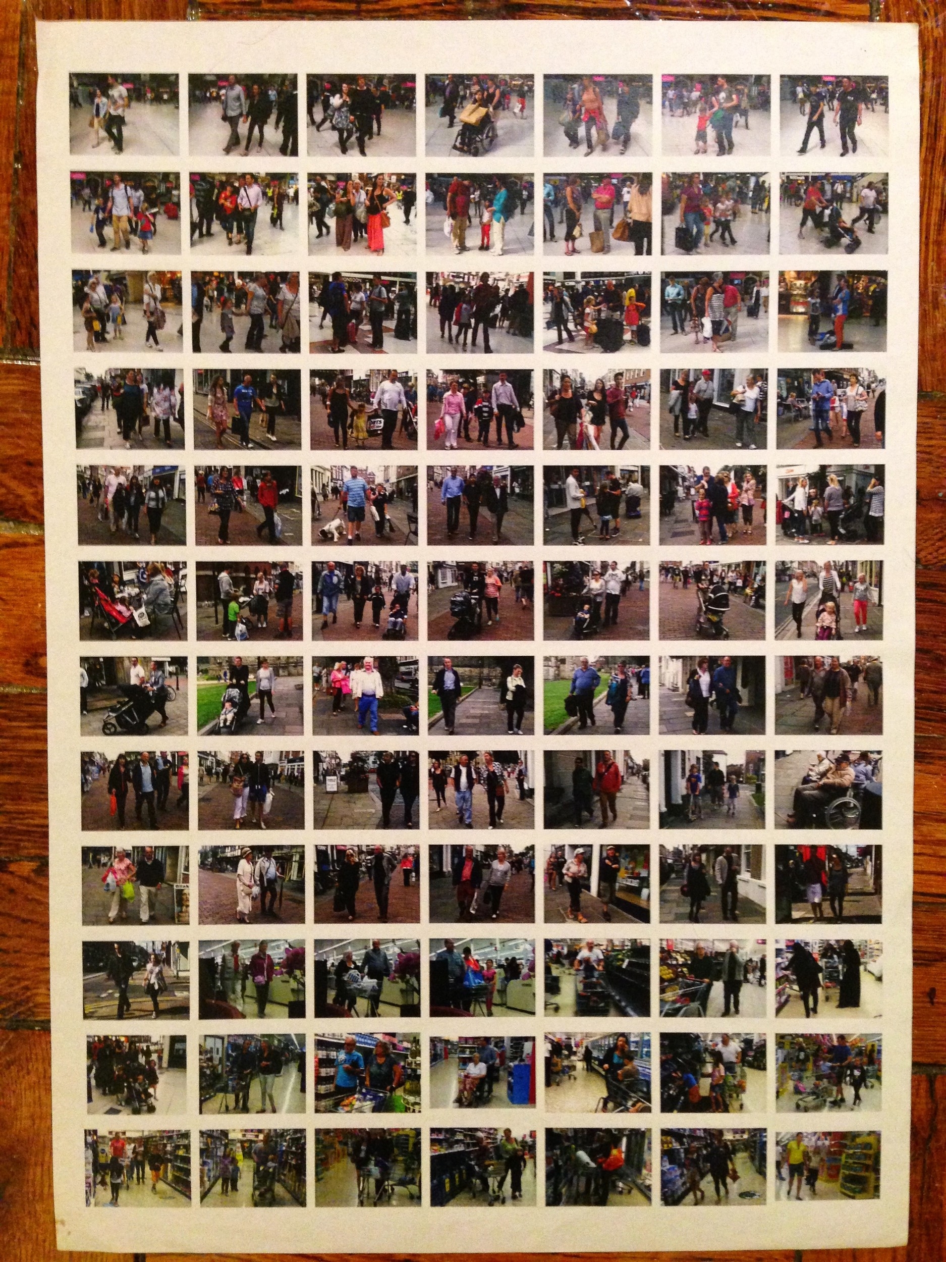
Through exercises like the one below, we first learned about space in a more abstract way. Precisely measuring objects in stores around London, we had to work together to create a mathematically exact yet flat replica of a grocery store. Working out of a beautiful converted warehouse studio in North East London, we attempted to recreate the world around us. The exercise played with our ideas of size, perspective, and objects in general - what makes something come to life?
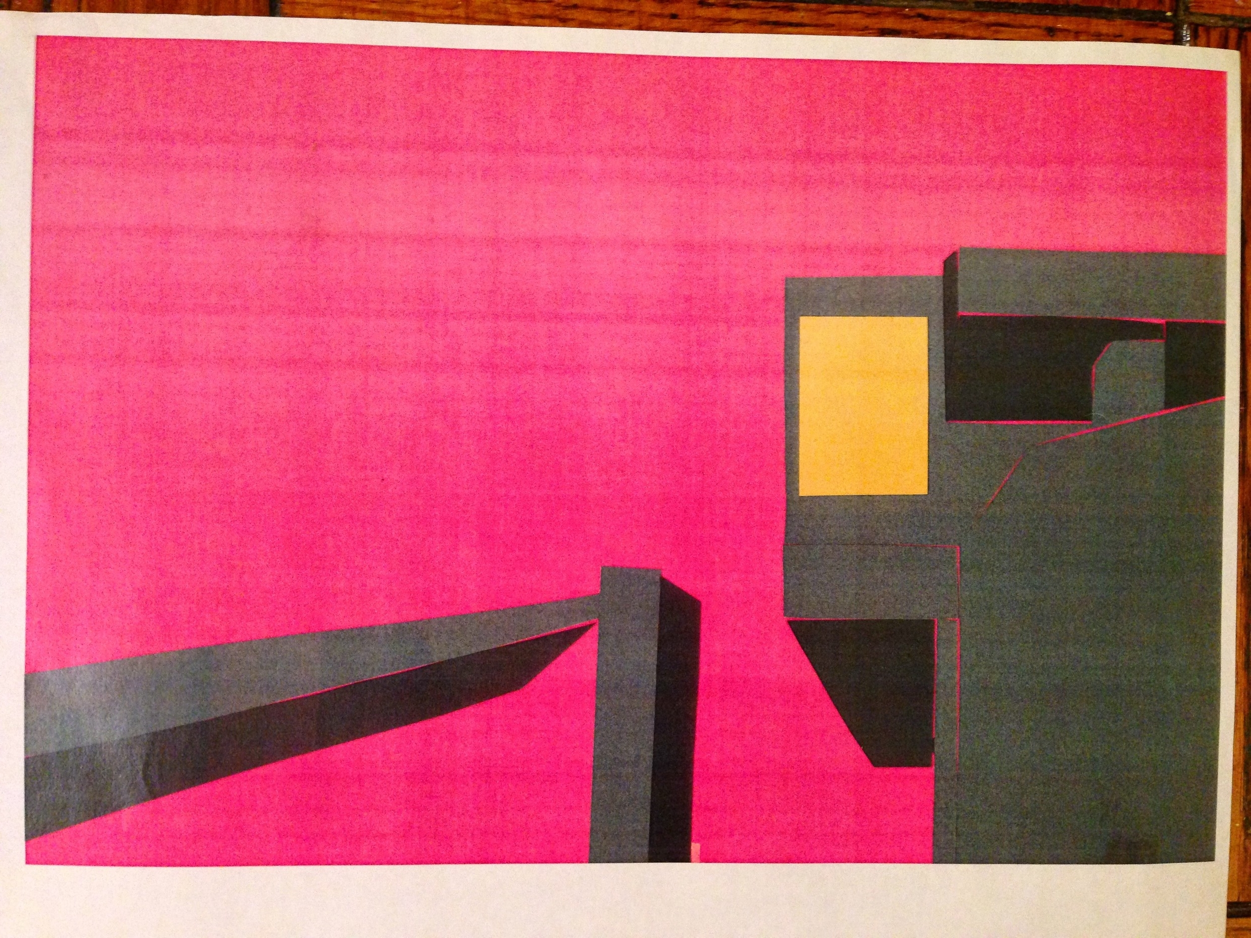
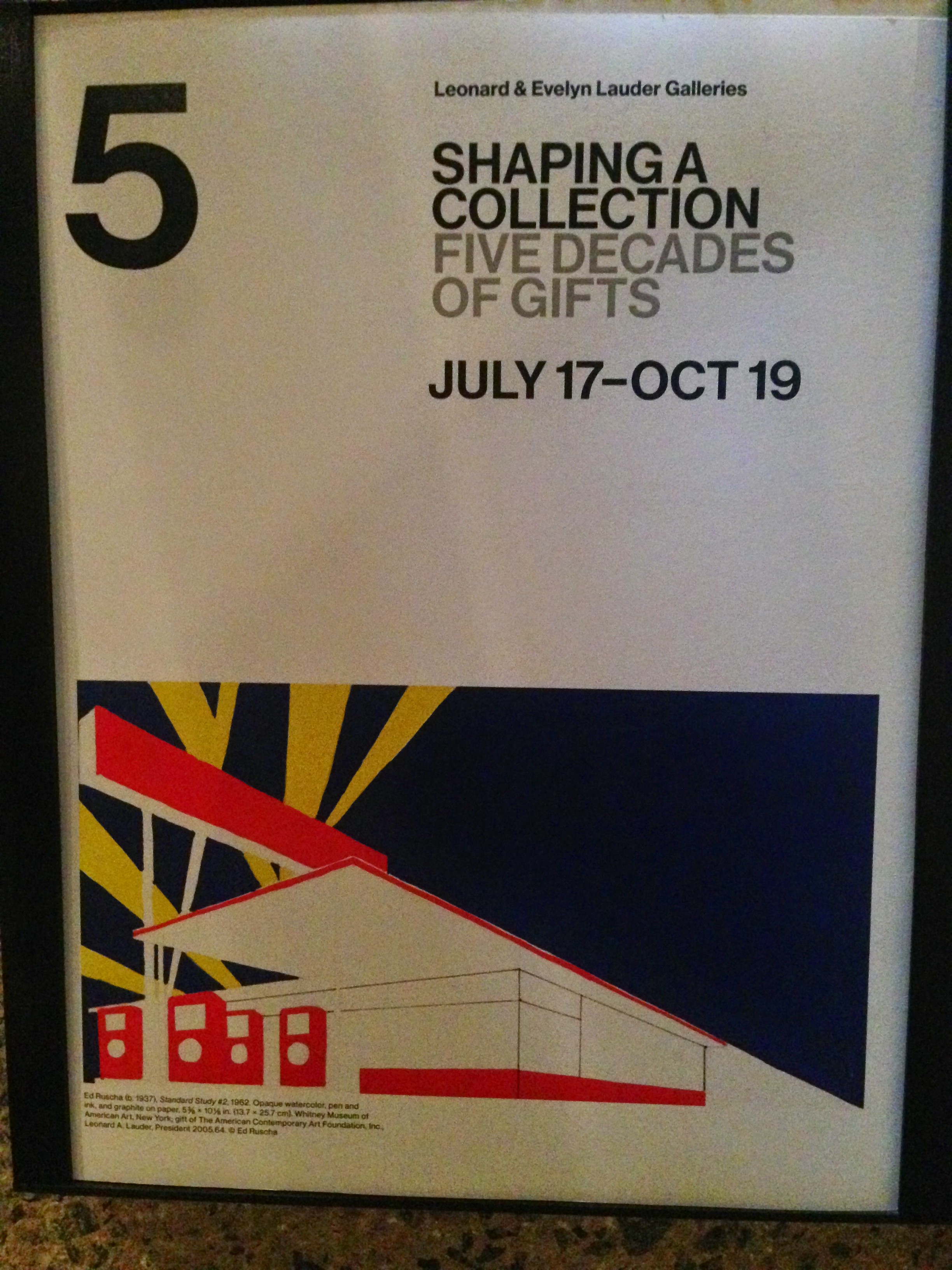
We used cutouts and collage, to map larger scale observations of the 1970's architecture. Years later, I was walking through the Whitney and an image caught my eye. The perspective and coloring looked so familiar -the parallels were comforting to see.
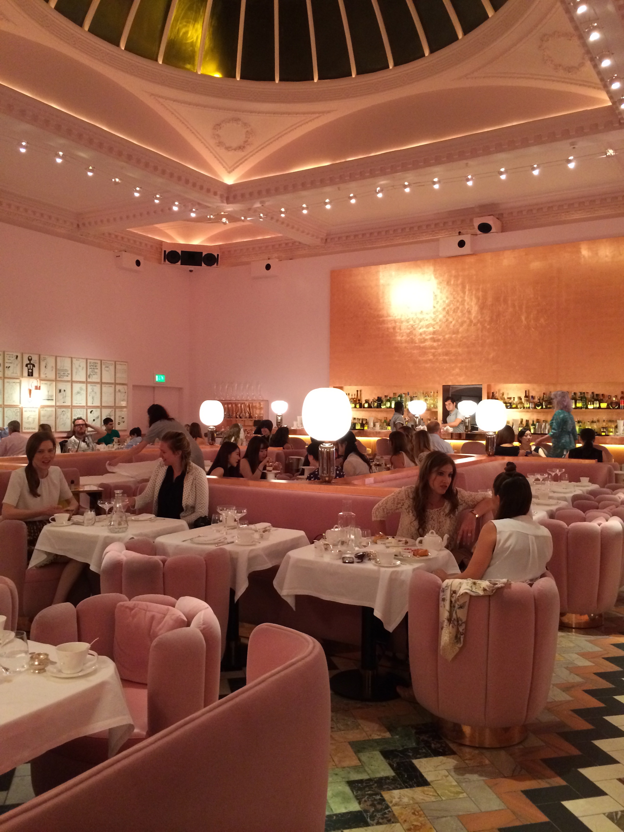
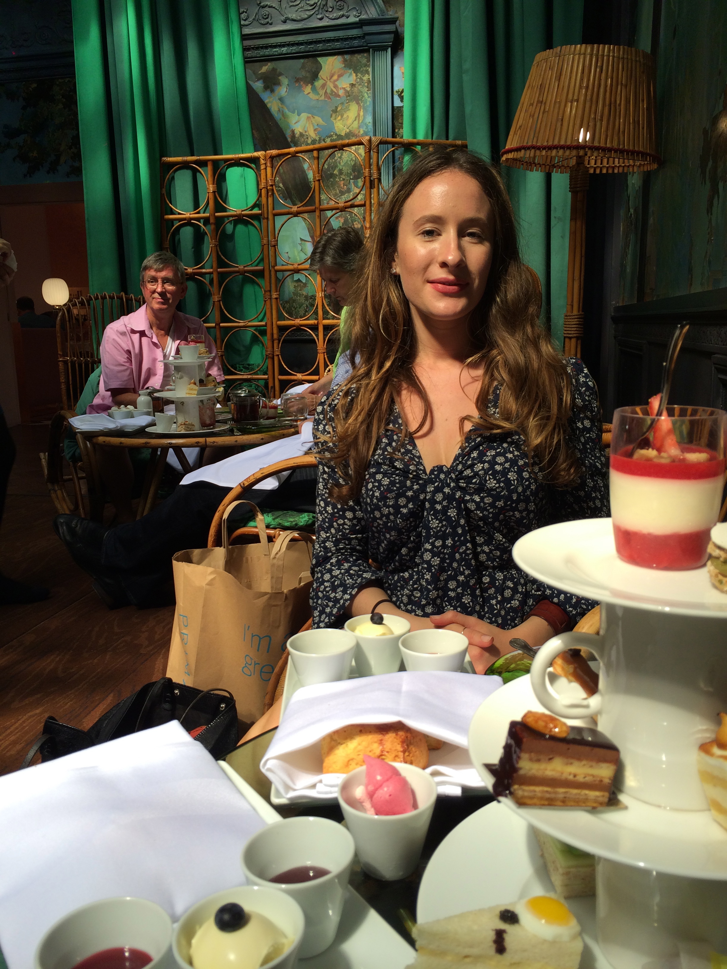
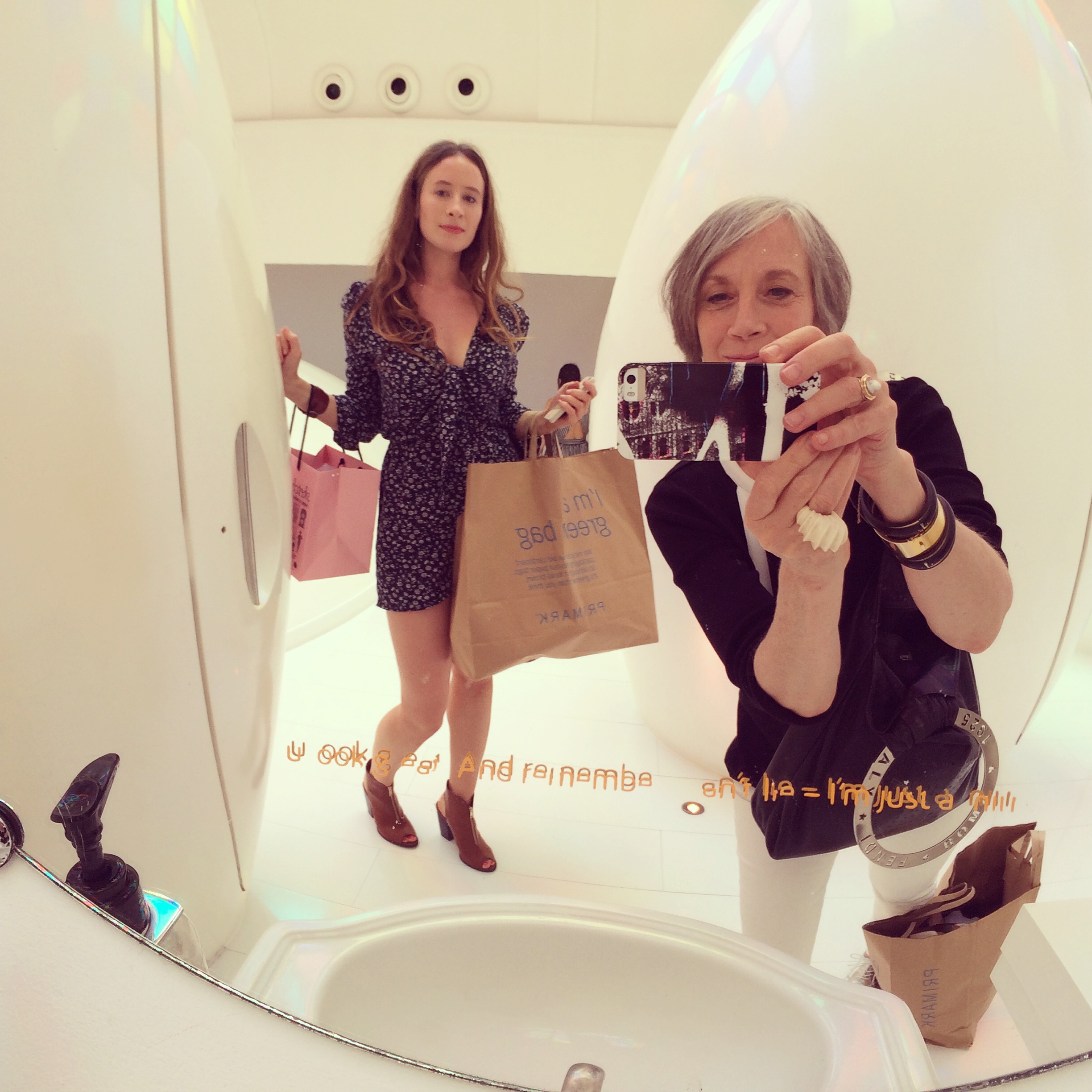
Increasingly, we ventured further. I had studied abroad in London a year previous and the city felt like home, but our professor sent us off into the city and ensured we took notice of the incredible design available to us. One destination was the iconic restaurant, Sketch. Years later I returned on holiday with my mother-to this day I think it one of the most brilliant places I've ever been!
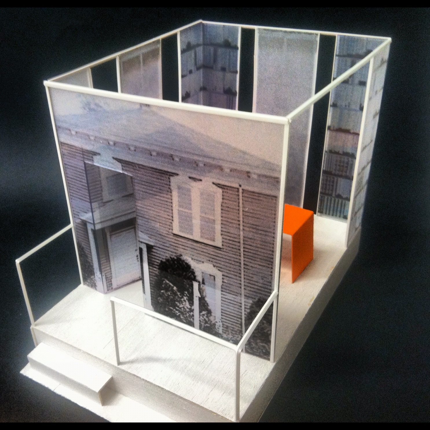
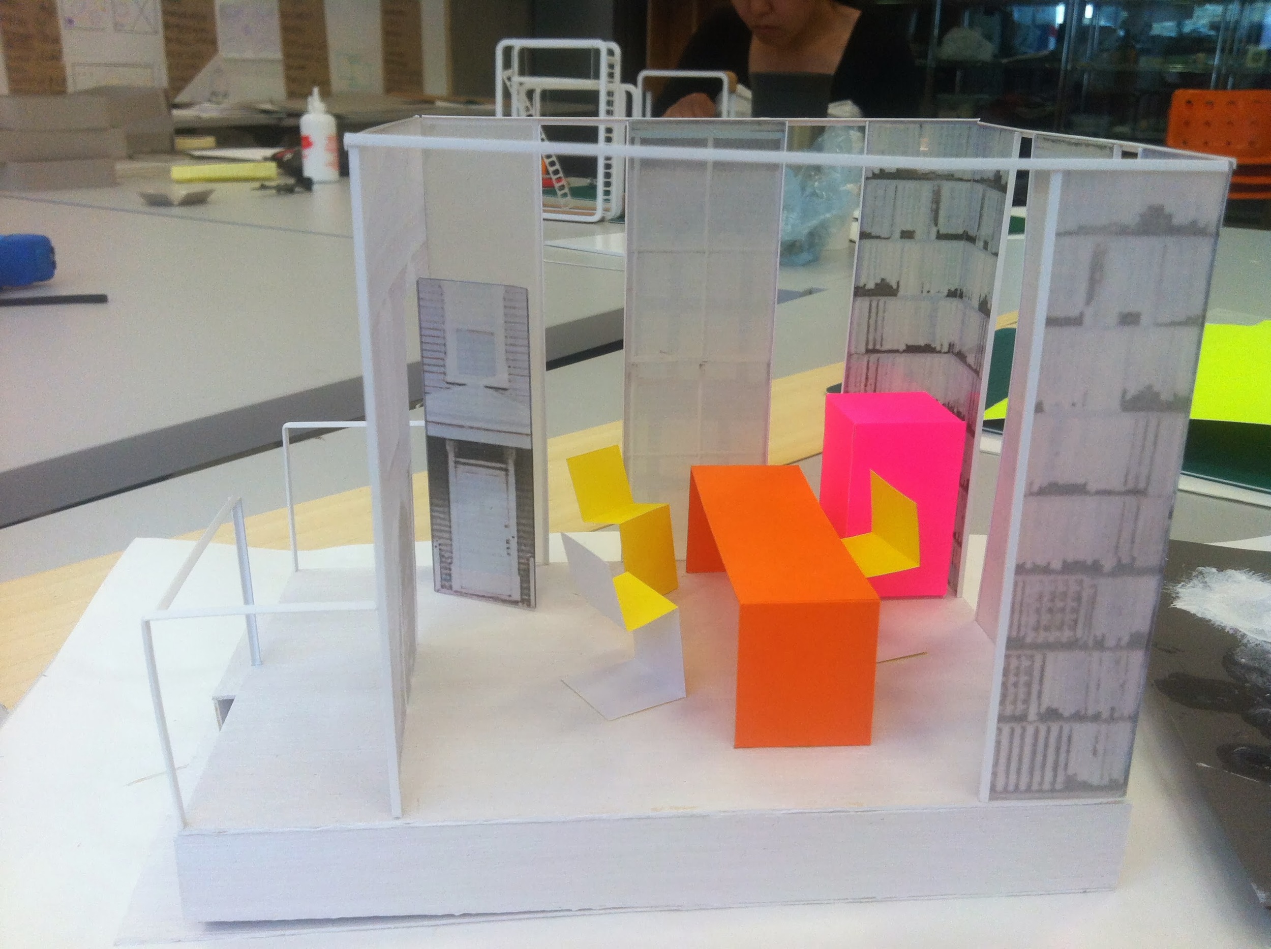
Our final project, the culmination of the course, was to create a pop-up shop for a popular brand assigned to each of us. However, the space would not sell their primary good-based on our analysis of the brand, we had to decide what industry they would logically venture into if they decided to pivot.
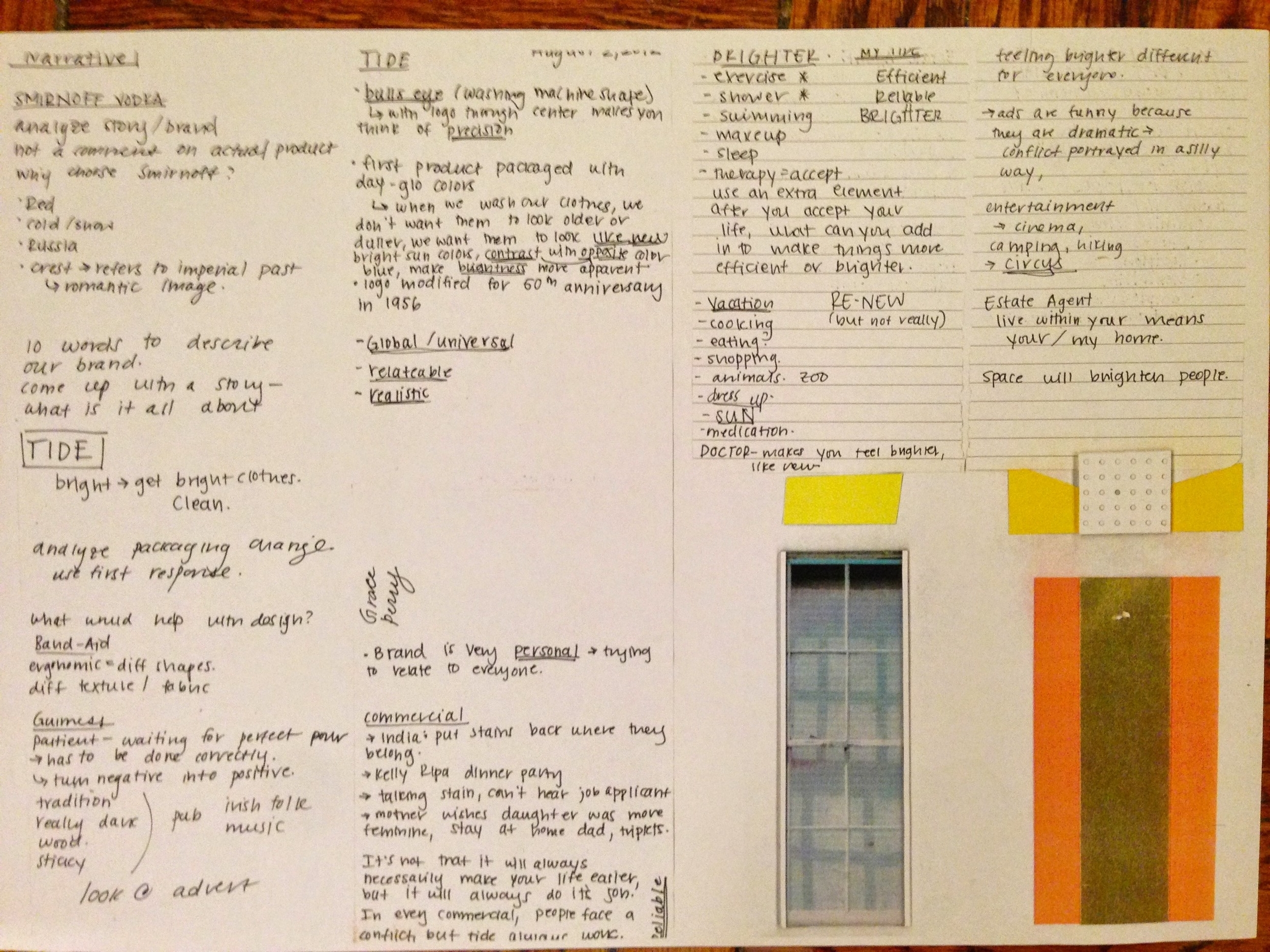
The project incorporated a study on marketing, PR, history. It forced us to think about all of the things that both influence design and make it such a necessity. Commercially, design serves a very specific function of conveying a message. and therefore, a deep understanding of what this message is exactly is required. If this can be achieved for a company brand, the same can certainly be applied to personal home design.
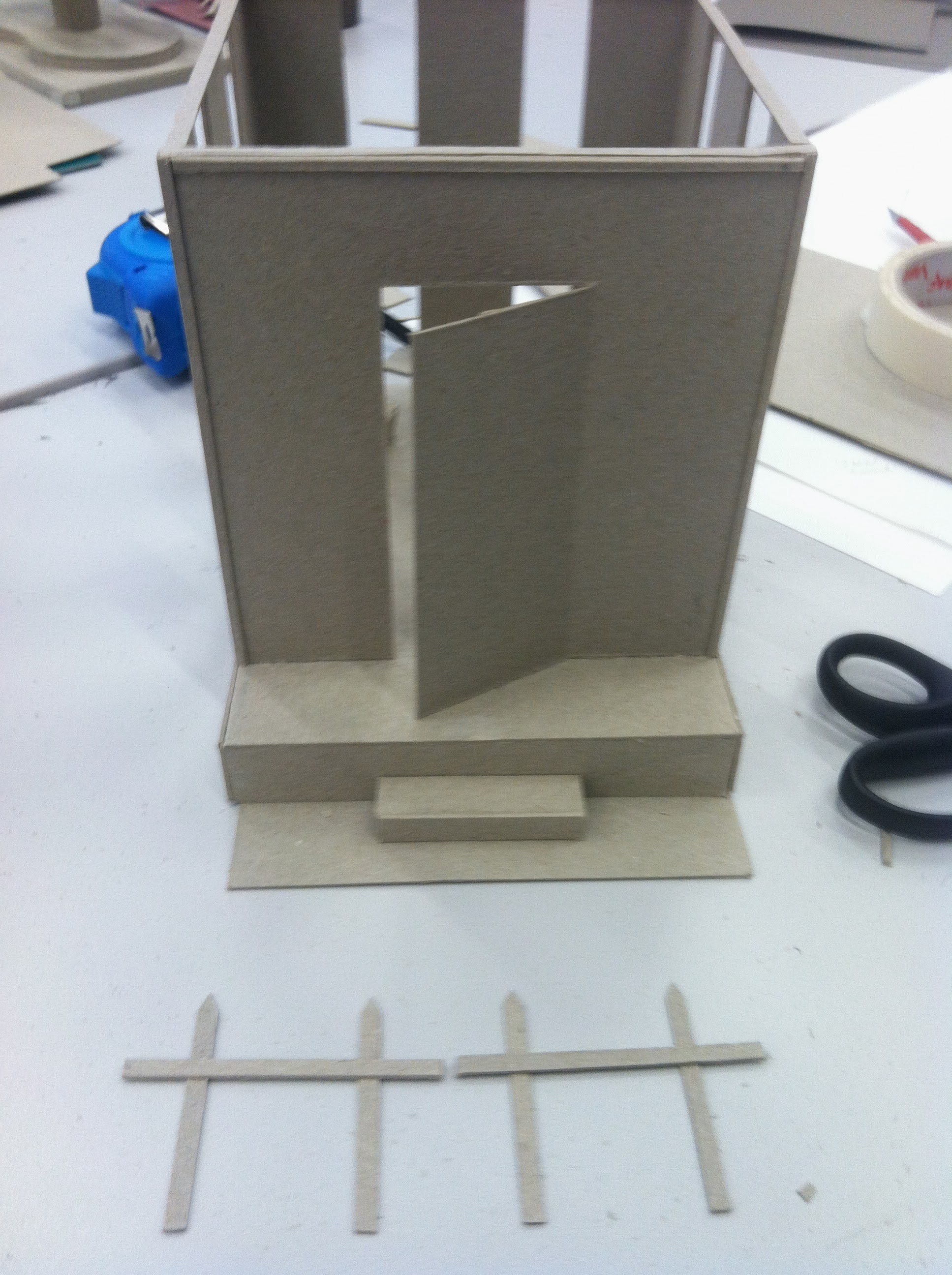
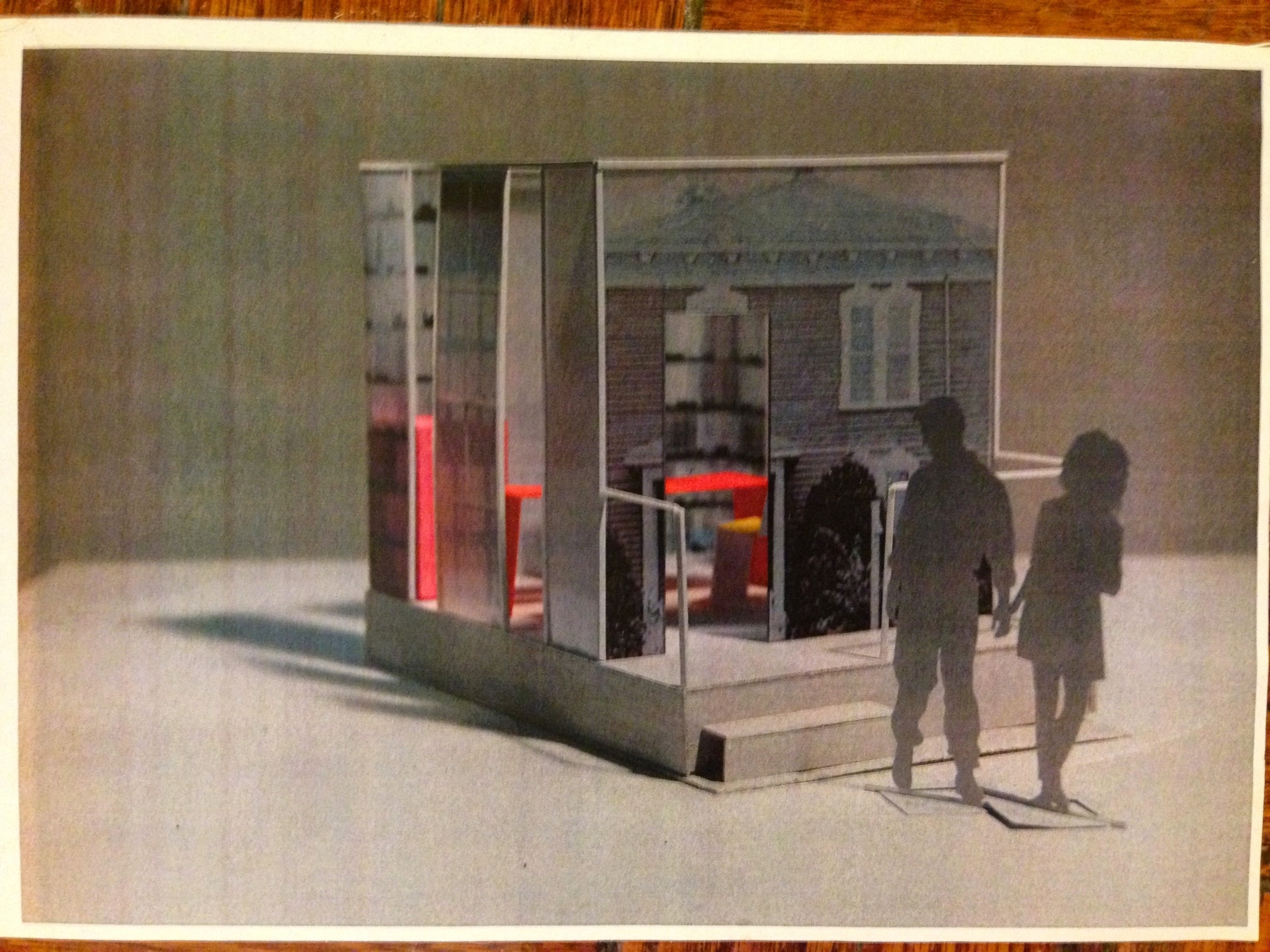
My brand was Tide. A family-centric company, I decided their next venture could be estate agents. Clean and airy, I wanted the space to be sleek but not distracting- glass walls, muted colors, but their signature orange pop for furniture. But a family home ultimately needs to be nurturing- and I wanted to convey the idea of this in the estate agent space itself. I looked for a classical, modest structure, and the idea was to imprint the image onto glass. The inside mimicked large, light filled windows and old bookshelves from a cozy library. The only "real" part of the house would be the porch, the entrance into the next chapter.
This incredible class changed the way I think about design and see the world. Every time I walk into a space - a shop, a home, I think about the intention behind every decision made; every color, object, wall. After one month, my perception was changed and my understanding of design being both essential and inherent in the world around us solidified.


