




back lighting translucent glass to make a room divider
Interior Design Magazine
Nov ‘07
Photo Florian Kresse
back lighting translucent glass to make a room divider
Interior Design Magazine
Nov ‘07
Photo Florian Kresse
an easy way to make a room divider is by back lighting glass or any other translucent material

bringing light to another area with translucent glass
translucent glass
PND Magazine Dec 99
photo Erhard Pfeiffer
bringing light to another area with translucent glass
translucent glass
PND Magazine Dec 99
photo Erhard Pfeiffer
While working with an architect on a gut renovation, I wanted to bring the light from the entry hallway to light the back wall of the bath area. Conversely the wall of translucent stone could illuminate the entryway when only the bathroom was lit.
Rendering/Karsten Johansson
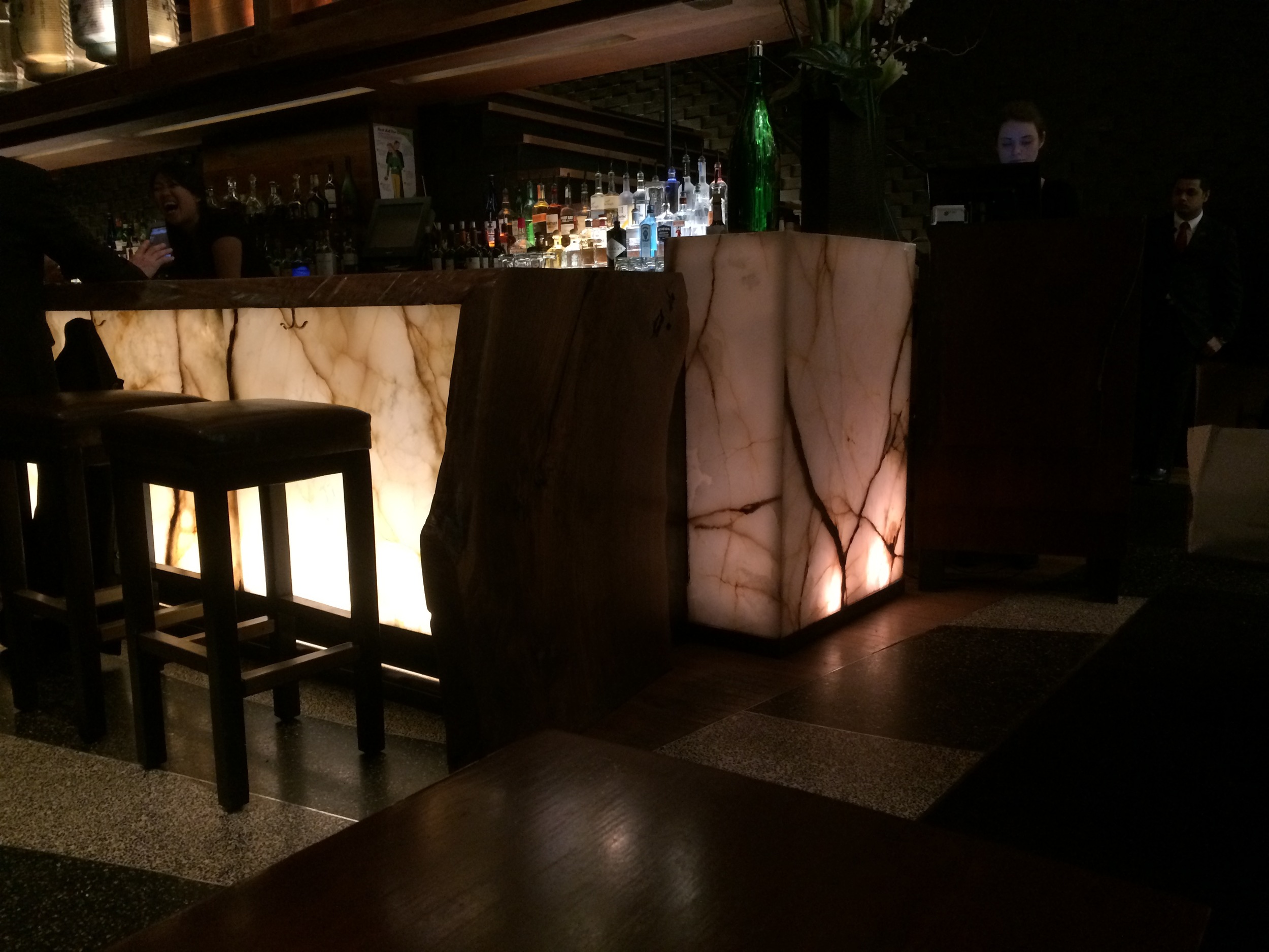
Nobu Restaurant lighting the stone from within
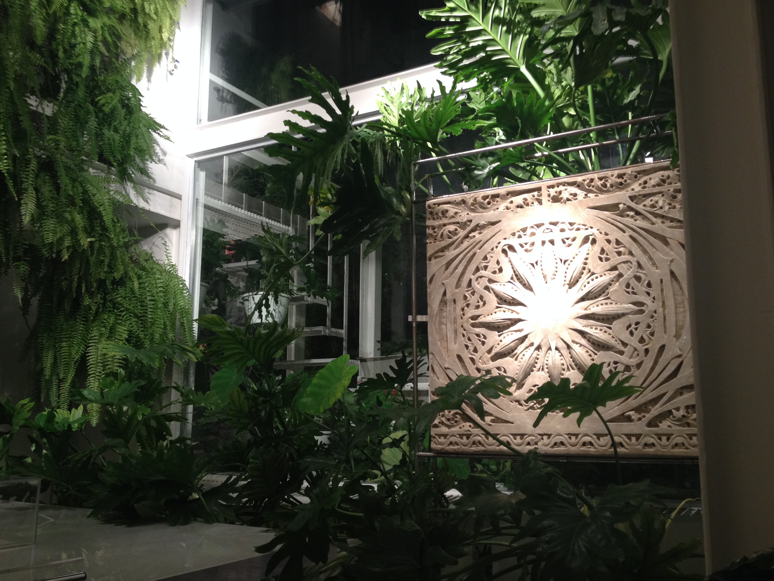
We can play with translucent surfaces to magnify the ambient light both from the front and behind.
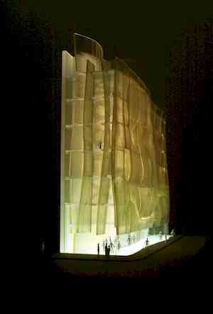
modern building material

bringing light into a building and reflecting it out
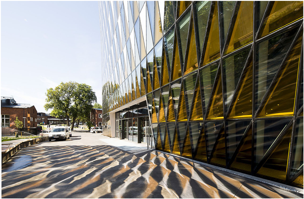
A breakthrough occurred with the building of modern edifices when they were made with large spans of steel to support bigger and heavier pieces of glass. This building brings more light to it's interior while reflecting light and its shadow back out onto the street.
Photo/Tord-Rikard Söderström
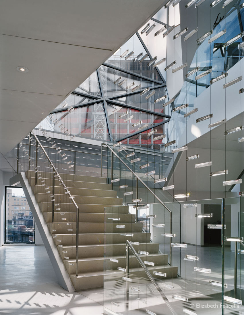
mirror, light, and crystal work their magic
Work AC brings light in through the stairwell with a mirror that focuses its reflection on guardrails laced with SWAROVSKI CRYSTALS at DVF headquarters, NYC. The combination of light and glass results in magic.
Skylights headling
SKYLIGHTS
Skylights headling
SKYLIGHTS
With advances in construction, as early as 2,000 years ago, the Roman Parthenon's skylight (118 AD) bathes the room with light from above. This concept must have seemed as revolutionary as computing technology does for us today. With the advent of improved glass making and building know-how, by the 1800’s these openings could support glass enclosures, protecting us from the extreme elements of cold and rain.
Both the Metropolitan Museum and the Guggenheim in NYC have incorporated the beauty of skylights into their exhibition spaces. At the Guggenheim Museum, architect Frankl Lloyd Wright featured the skylight as an anchor for the building. We move around its perimeter to view the artwork.
Metropolitan Museum
Guggenheim Musuem

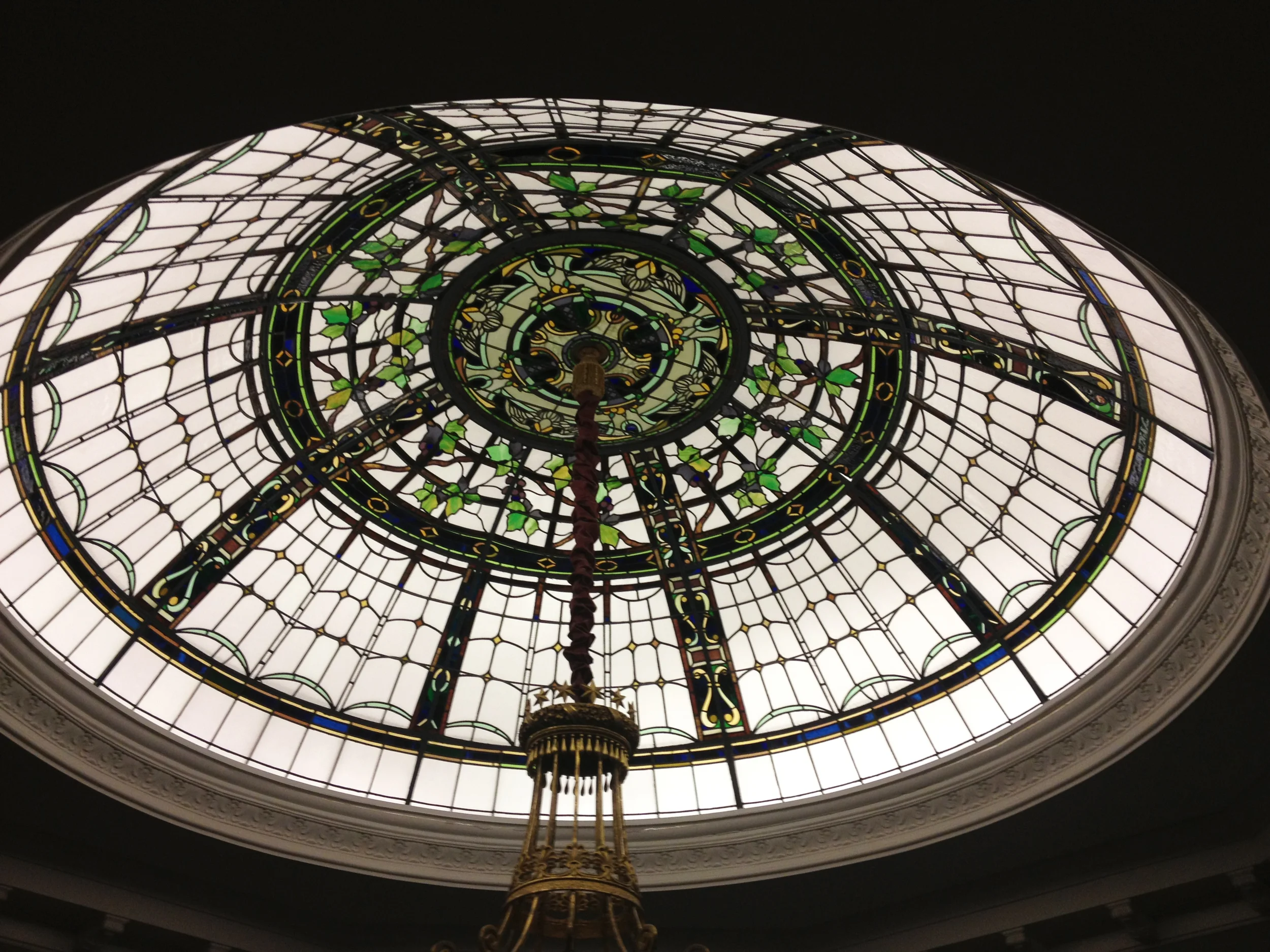
Jewel encrusted Stained Glass Skylight National Arts Club Gramercy Park, NY
Jewel encrusted Stained Glass Skylight
National Arts Club GRAMERCY PARK, NYC
Photo/Eileen LeGuillou
Jewel encrusted Stained Glass Skylight National Arts Club Gramercy Park, NY
Jewel encrusted Stained Glass Skylight
National Arts Club GRAMERCY PARK, NYC
Photo/Eileen LeGuillou
Caramoor stained glass
Caramoor stained glass
Caramoor stained glass
Caramoor stained glass
Caramoor stained glass

Shaker skylight shows off simplicity
A SHAKER ROOM where the room's simplicity meets skylight
Shaker skylight shows off simplicity
A SHAKER ROOM where the room's simplicity meets skylight
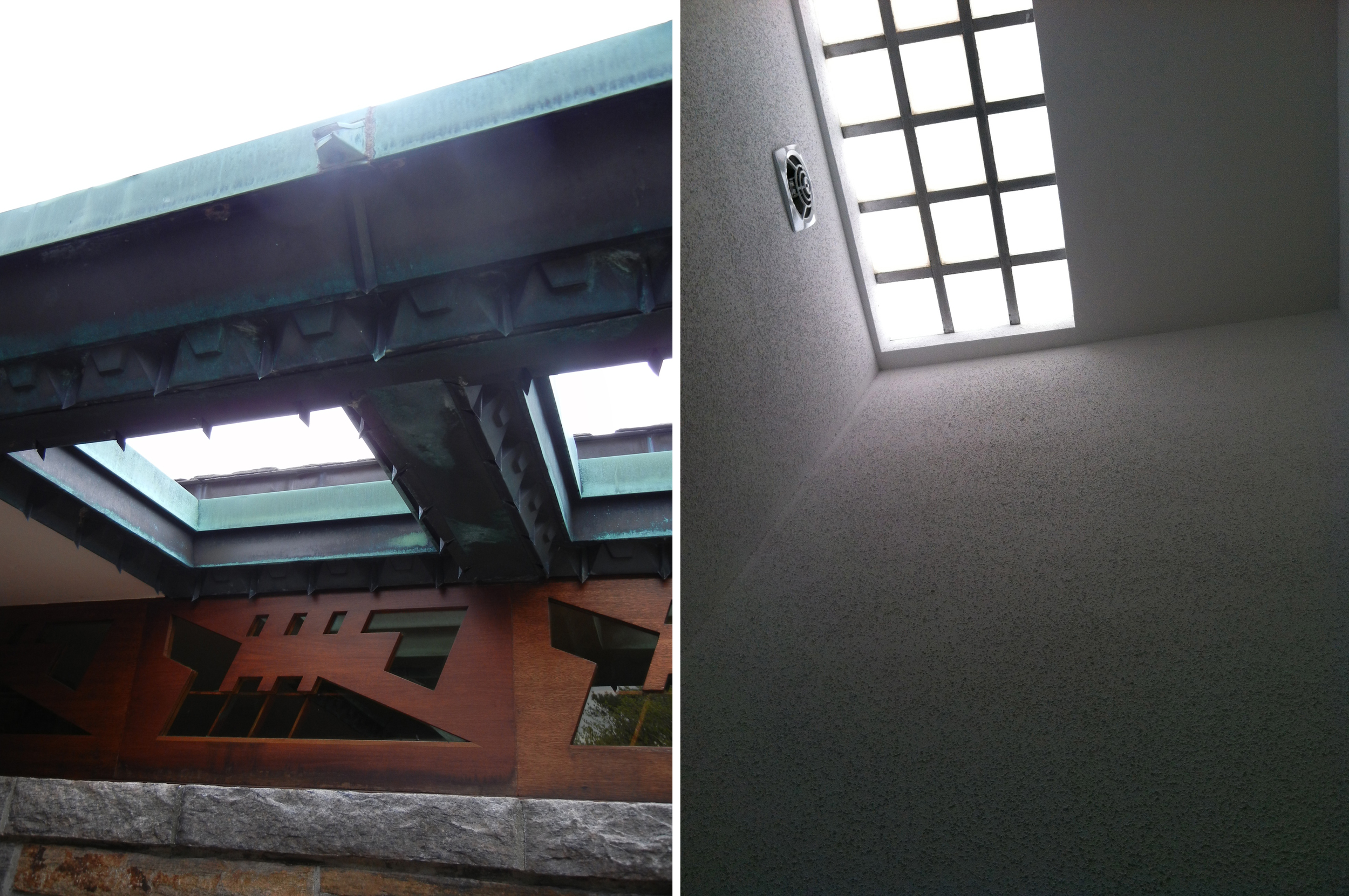
Frank Lloyd Wright incorporated skylights into the eaves of his residential building. He also placed them in his soaring but narrow high-ceilinged bathrooms.
This is an easy and eco friendly solution to bringing natural light into a dark interior - if your room has roof access, Solatube.
WE are DOWN with DOWN LIGHTING

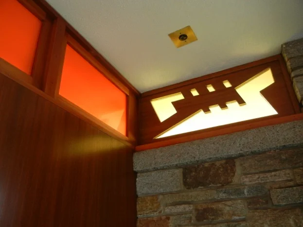
Frank Lloyd Wright down lights and clearstory
FRANK LLOYD WRIGHT incorporated clearstories and down lights into his architecture. When they first came on the scene in the 50’s, he was the first to place eyelids on the down-lit fixture so the light could be adjusted directionally.
Frank Lloyd Wright down lights and clearstory
FRANK LLOYD WRIGHT incorporated clearstories and down lights into his architecture. When they first came on the scene in the 50’s, he was the first to place eyelids on the down-lit fixture so the light could be adjusted directionally.
In a residential setting the most unimaginative and harsh lighting has to be pocket ceiling lights. I understand that they attempt to evenly illuminate a room. But at what cost? The lighting fixture is installed into a hollow opening in the ceiling. In older structures beautifully molded ceilings have to be eradicated or “dropped” to accommodate these fixtures.
These lights which go by different names - recessed accent lighting, pot lights and down lights are some of the most offensive lighting on the market. Considered revolutionary for their time, designers have been moving away from them in favor of more serene solutions.
These lights can’t help but cast an unattractive scalloped light and shadow on the walls. To avoid these pools of light, the designer and installer should be aware of how close to space the fixtures as well as the ratio of distance from the wall to ceiling height. If not, they look like this. Dare we be more creative?
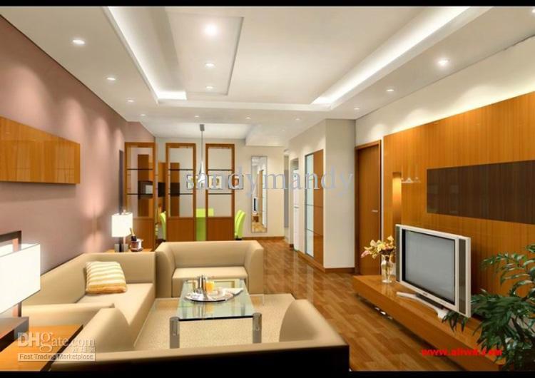
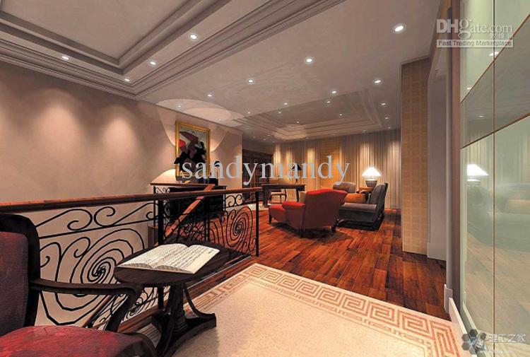
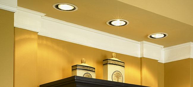
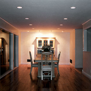
Unless performing a medical procedure (okay, maaaybe for kitchen prep), or lighting artwork. Or if you just can’t live without them, then they can be put on dimmers. For a softer more soothing alternative and a sense of zoned contrast try these: a strip of lighting discretely placed under the kitchen cabinets, or over the cabinets if you have the space between the cabinets and ceiling, living room wall sconces, floor lamps, table task lighting, or ceiling chandeliers.

Interior lighting must bring us tranquility
For us and our urban lives here in New York, we all want to come home and have a sense of oasis. And I find that if you do walls of light or a tall vertical light as opposed to bright single lights all over the apartment, that's better. Because scattered single lights break up your eye visually and don't really calm it down.
- Campion Platt, lecture at D+D Building, NYC
Lights off - from below
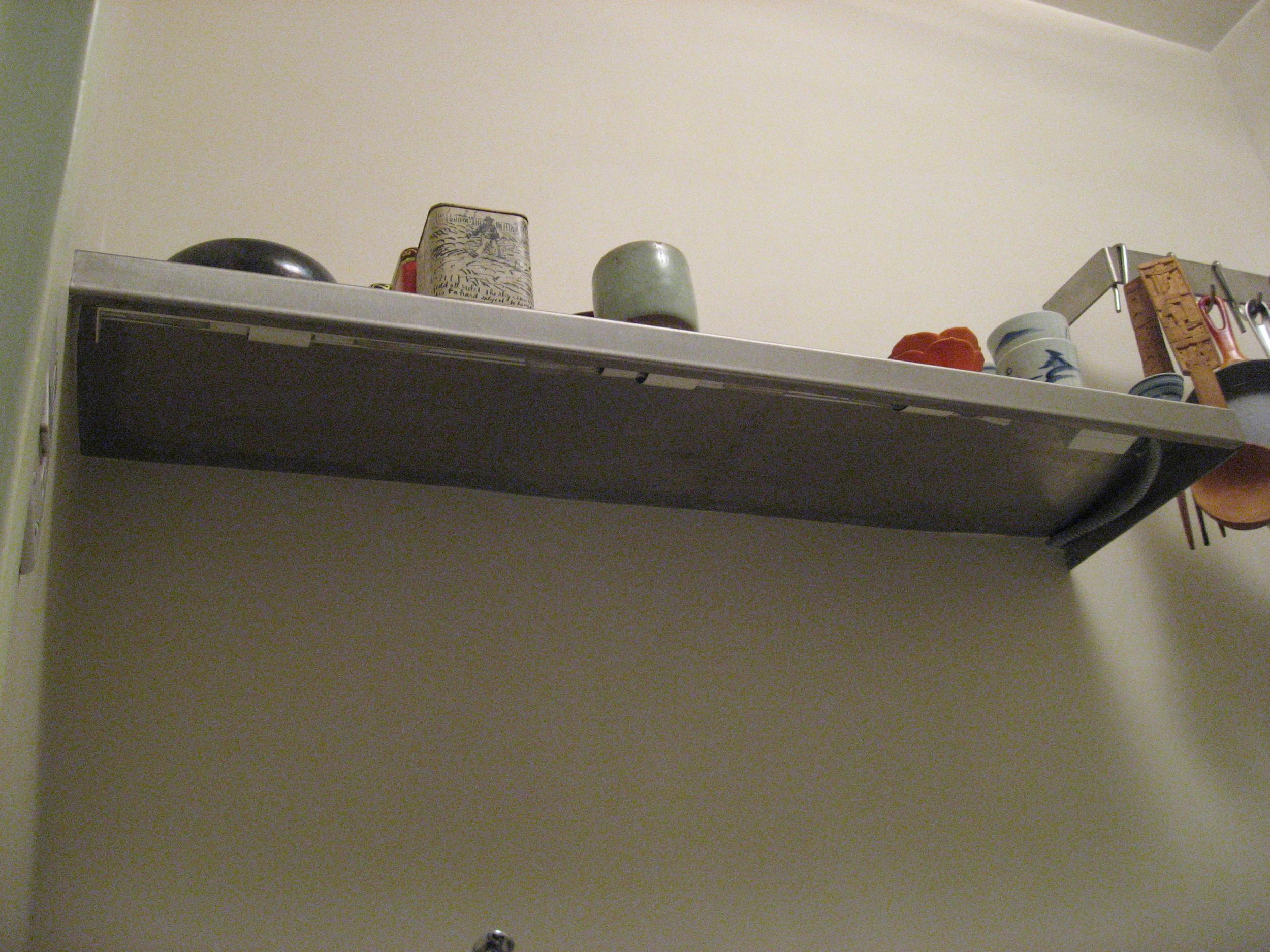
If you’re lighting a counter for food prep in the kitchen, this can easily be accomplished with under the counter lights. Here is a place I used them, bringing a warm ambiance to the food prep area.
Lights on - from below
A shot from the under side shows the simplicity of the design - with lights off and on. Now that LED strips are used, they don’t generate heat and use less electricity than these bulbs.

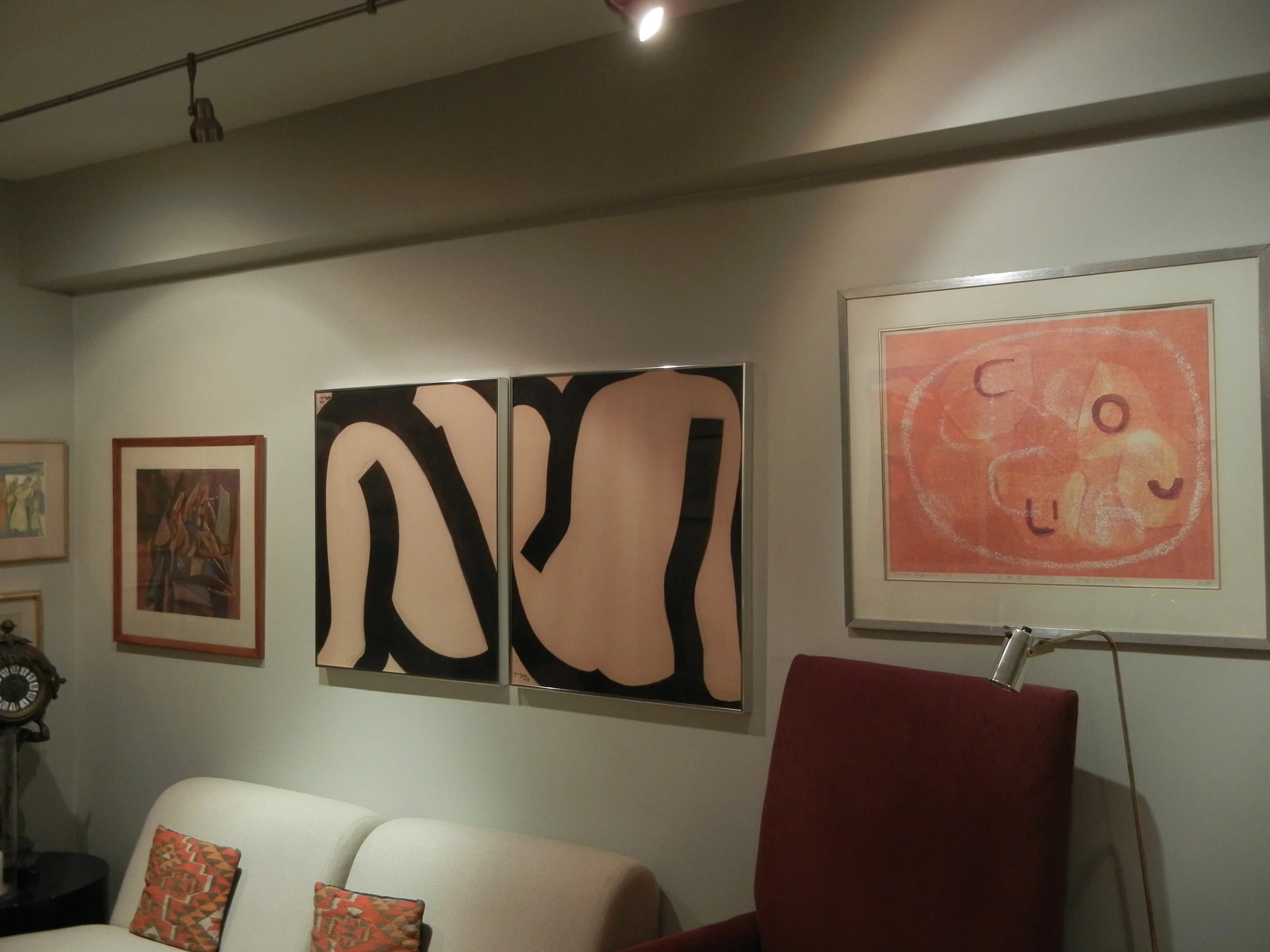
track lights to feature artwork
My friend’s mother’s apartment, NYC. As we hung the artwork we adjusted the track lights to shine on specific pieces.
track lights to feature artwork
My friend’s mother’s apartment, NYC. As we hung the artwork we adjusted the track lights to shine on specific pieces.
Par cans light artwork and foliage. Because this interior was designed by the über talented architect, Paul Rudolph, it holds its own today - some 35+ years later. This is because he used track lighting to create drama.
Turrell
ROOM LIGHT SO AFFECTS OUR MOOD
Turrell
ROOM LIGHT SO AFFECTS OUR MOOD
James Turrell the light sculpture artist, once said to me, “We are drawn to the light like moths to the flame.” How right he is. I will never forget the enchantment I felt the first time I walked into a Turrell exhibit.
Feeling a bit disoriented and unsure where to step, being unsure of exactly where the light started and where it met its shadow. It was exhilarating. He forced all our senses to interact with the space! His works seem tamer today-since encountering a lawsuit over someone being too disoriented by the light.
“the eye would not be able to see the sun if, in a manner, it were not itself a sun.”
Juan Rafael Coronel Rivera imparts a unique spin on the relationship of our eye to how we see in his book Frida Kahlo. He quotes the philosopher Plotinus.
NOTE: In these posts on Illumination I've used metaphysical and poetic adjectives to try and describe it: reflection, luminosity, holding reflecting and absorbing the light, glow, atmosphere, eminence, shine, refraction,objects dancing on the light, etc. Why do these illusive adjectives come up again and again? Is it because light is not a material we can touch? Yet we are constantly being touched by it. It seems impossible to put our finger on its pulse. But this I do know, light needs physicality to hit up against, as a way to reveal itself to the world, our world.

