



Vera Lutter photo Albert Hadley on collecting…garbage
my friends are used to having me stop cabs and race back to pick up something I've seen on the curb.
Albert Hadley
(photo Vera Lutter)
Vera Lutter photo Albert Hadley on collecting…garbage
my friends are used to having me stop cabs and race back to pick up something I've seen on the curb.
Albert Hadley
(photo Vera Lutter)
what goes around...
BEing A GOLD DIGGER pays (or shall we cal it a green digger?)
"Given Mr. Hadley's travels in the realms of gold it is pleasant to hear that he found several of his own treasures by beating the Sanitation Department to a pickup. 'The writing table with the blue cloth top I found on the street, and the tables by the beds in two of the guest rooms. And once [Mr. Hadley is visibly warming to his subject] I was walking on an uptown street, saw a glimmer of gold in the trash, and out came this beautiful Regency gilt bracket.'Finding a Chippendale sofa just before it was to be turned into landfill was especially memorable. After being recovered it was 'wonderful.'" HOUSE & GARDEN'S BEST IN DECORATION, 1987 INTERVIEWER AND PHOTOGRAPHER UNNAMED.
It sounds like Mr. Hadley (whose clients included the Astors and the Rockefellers) was careful of the footprint he left long before it became the right thing to do. Here’s a look-back at some recent antecedents of the interior design scene that brought us to where we are today.
PERSONAL ANTI(QUE)DOTE - THE CHANGING TIMES WE CAN SAY GOOD BYE TO
I am grateful for the times we live in when I hear my mother tell how in the 60's she couldn't enter the showroom,the great purveyor of “fine” modern furniture, unescorted by a decorator. That’s what they called an interior designer back then. The only other show in town for those going about it alone was the select department store where they showcased incredible “rooms” that were the inspiration for everything new and current. I remember being dragged in tow to these places. My mother, wanting the best of both worlds, hired a decorator for showroom entry.

French Country furnishings midcentury
House Beautiful Photo that inspired my mother in the late 60’s to move from her Mid-Century furniture to what she called her French Country look.
House Beautiful photo/Grigsby
French Country furnishings midcentury
House Beautiful Photo that inspired my mother in the late 60’s to move from her Mid-Century furniture to what she called her French Country look.
House Beautiful photo/Grigsby
My mother's translation of this look, with the help of her “decorator”. My mother being who she was, was the engine feeding him ideas.
the changing times we live in
THE TIMES ARE A CHANGIN'
the changing times we live in
THE TIMES ARE A CHANGIN'
The playing field is now leveled! There is no longer this attitude that only the elitist can reach into the upper echelon of residential interior design. Today it is not out of range for the middle class to have a beautiful abode.
We have unprecedented access to a multitude of venues. The internet has become the great equalizer. Sites and ads pop up every day competing for shoppers with limited time (women with jobs, oh no!) except for the endless hours we’ve carved out to spend connected.
With online furniture stores and blogs linking us to selling sites, pop up ads knowing exactly who we are and where we searched, repinnings, bookmarking, liking, pinterest-ing, instagram-ing, and eBay-ing we all have a plethora of resources at our fingertips. Hello Alaska.
Sites touting exclusivity with flash sales, access to any showroom, retail store, flea market and tag sale. Enough to make us dizzy. Maybe our problem is in reverse of the bygone days; not too little access as my mother had, but too much! The flood gates have opened and it seems where the consumer goes and the money flows, products abound.
About 10 years ago I was in a kitchen & bath fixtures showroom shopping for a client, when I overheard a women so well dressed turn to one of the two men she was with and say, "But you won't let me have it."
Of course I assumed she was addressing her husband. Well guess again. She was talking to her decorator in her husband’s presence. My jaw probably dropped. To borrow a slogan from Virginia Slims cigarette ads of more than a generation ago: “You’ve come a long way, baby.” And so we have! Baby?!
That day I was ignored during my visit to unsaid showroom. I forgot to dress the part….and to bring my decorator along. I returned the following week wearing my tres elegant sheep skin coat and jewelry. Was I ever doted upon!
A friend tells me of having been a sales person for a French furniture store owner setting up shop in Soho in the 90’s when lofts were still inhabited by it’s early settler – the artist. The owner must not have yet realized who his clients were (he was French) and snubbed them (he was French-oh did I said that already?) simply because they looked poorly dressed in paint stained jeans and sneakers. She would watch as many a potential sale would slip away.
Well fast forward - eBay does not care if we look the part…baby.
And now that our past decades of stark modernism has crumbled and we are embracing “artifacts” from the past at an ever quicker rate, this eclecticism gives way to a broader acceptance of different styles and individual expression. We can truly say we are sharing a global economy and a global market.
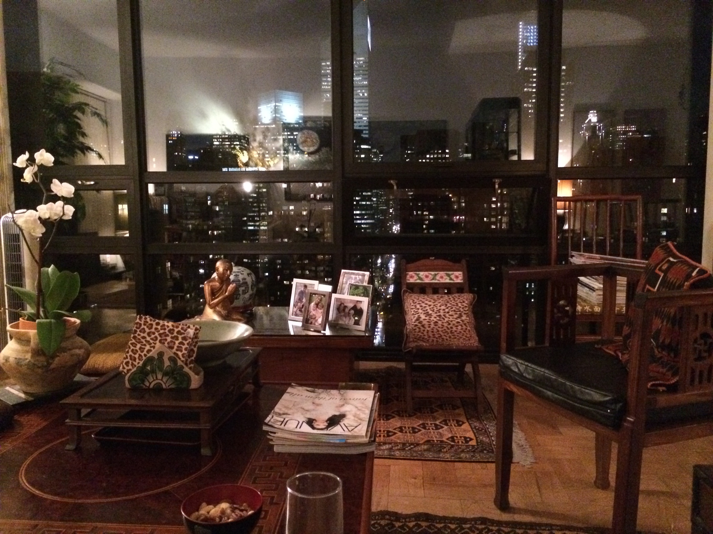
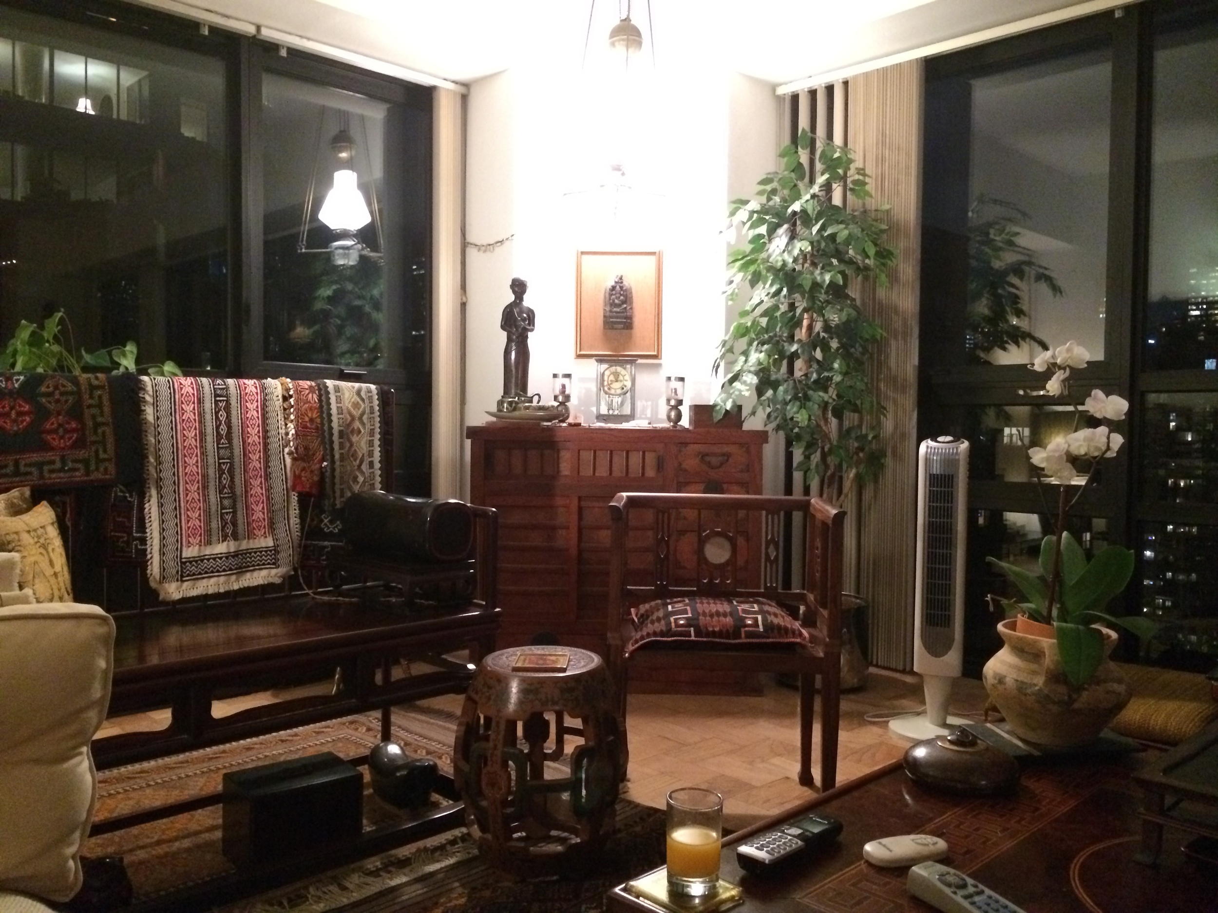
eclectic design with a view
My dear friend Leela’s apartment with its world class view showcases her finds from the various places she’s lived in and travelled to.
The mixture of folk crafts from around the world and family heirlooms or keepsakes we have been entrusted with, or our newly found ‘used’ treasures from local vintage stores or flea markets, mixed with modern pieces from midcentury (hot, hot, hot) onward, bring us a potpourri of visual interest that would have previously existed only on the edge of bohemian fringe. Bohemian fringe is now mainstream! All we have to do is look at Autumn ’15 fashion to validate.
In Alice + Olivia's Pre-Fall 2015 shot, the interior mimics the clothes and could be a clone of my friend Leela’s pad.
Another factor that has changed our view of home is a result of 9/11. Since that event we have evolved into a society that values the home and the comfort it harbors away from the assaults of the world.
We spend an unprecedented amount of time on activities at home; including in our home office connected to the internet. Our exposure to the vast world has never been greater as we sit in our rooms absorbed in people and places we might never personally meet. At home our “real” universe is fully integrated with our virtual one.
Today we crave to prepare foods for our household in an open concept kitchen, with the nucleus of the family, including small children, in close proximity. How different from past generations when children were sequestered away.
More than ever it is important to dwell in rooms that function properly for our contemporary lifestyle. A home is a place we nest, rest, rejuvenate in and recharge from.

Balthazar
Balthazar Its circular padded booths, lighting, and general subdued atmosphere was made to mimic a well worn French bistro. Right down to the faux antiqued mirrors, faux nicotine stained walls, and fake indents in the stair landing - as if years of steps wore them away.
Balthazar
Balthazar Its circular padded booths, lighting, and general subdued atmosphere was made to mimic a well worn French bistro. Right down to the faux antiqued mirrors, faux nicotine stained walls, and fake indents in the stair landing - as if years of steps wore them away.
Keith McNally, the restaurateur with the most staying power on this very fickle island called Manhattan is quoted as saying, “You have to provide the conditions, although it’s impossible to define what they are, to make it easier to engage with someone,” he says, “to talk, and almost to lose yourself.”
Keith McNally’s restaurants are about creating that magic to elicit intimacy of conversation. There is the Odeon which is a 30+ years veteran of the restaurant business. Then there is Balthazar and until recently Pastis – and Pastis is now gone only because the landlord’s wrecking ball demolished the building.
What is it that makes McNally one of the most enduring restaurateurs in a city starving for the next new to-be-seen hot spot? A town where few restaurants have the staying power to endure no longer than the initial WOW.
Although I initially did not appreciate his “fake” French ambience at Bathazar when it first opened its doors, over time and after multiple sittings for breakfast and dinner with friends and family, I came to appreciate his brilliance. And when my business colleague and friend one day switched our breakfast venue, I felt the difference. This place paled in comparison and the experience only served to reinforced my respect for McNally’s design brilliance.
Let’s see if we can uncover the ‘impossible conditions’ McNally refers to. The origin of the word restaurant is to restore. Not only our body with nourishment but also our spirit with beautiful, relaxed ambience. McNally knows this!

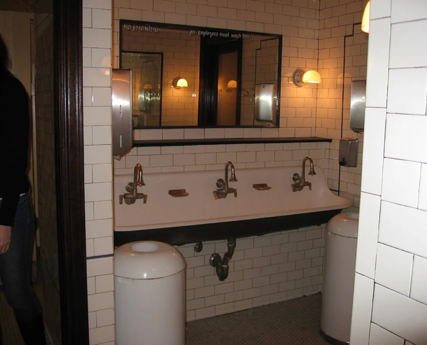
Pastis bathroom trough
Pastis A shared washing troth between the doors of his and her toilets.
Pastis bathroom trough
Pastis A shared washing troth between the doors of his and her toilets.
The story I heard while sitting on a Pastis bar stool.
restaurant failed, as he was sure it would, the seating could easily be removed. And he was sparing McNally an investment from what was sure would soon become a failed business. Flash forward 20+ years later and it was still going strong until last year when the new owners decided to demolish the building. Because after all this is now the MEET market.
I remember all too well the days before the Meat Packing district became the destination it is today. It was filled with putrid meat slaughterhouses by day and a condom lined selling the human meat red light district by night. The owner of the building leasing to what was to become Pastis pleaded with McNally not to put in stationary booths. He wanted him instead to go for free standing chairs so that when the
Just as we were getting ready to post going green, we came upon this newsworthy segment from ArchDaily with great photos of repurposed Movie Palaces from a bygone era as well as a discussion about the impact new building has on our environment. Why Old is the New Green

Frank Gehry NYTimes 2011
A Place Frank Gehry put his stamp on
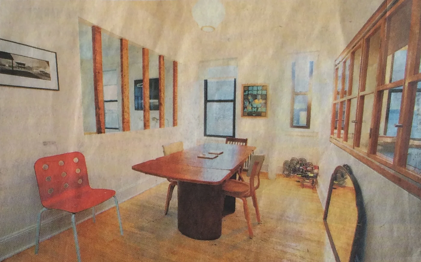
Rummaging through magazine cuttings - remember those? - I came across a NY Times article from 2011 stating that an ad for an apartment in 2005 read "renovated by a 'well-known architect'". But something else in the article caught my eye.
Frank Gehry NYTimes 2011
A Place Frank Gehry put his stamp on
Rummaging through magazine cuttings - remember those? - I came across a NY Times article from 2011 stating that an ad for an apartment in 2005 read "renovated by a 'well-known architect'". But something else in the article caught my eye.
What grabbed my attention was seeing that whomever designed the space, instead of completely opening up the space between rooms by demolishing the wall and putting up a steel beam to secure the structure, kept the existing columns in the wall and made them an integral feature of the opening. He worked with what he had and because of this showed off the beauty of the wood columns but still gave the open concept. This someone is Frank Gehry.
If we consider purpose and don’t fight the nature of the room, then everything else: the furniture, color and décor all fall into place. This is why mid-century furniture works so well in contemporary spaces. It was built in the same era and with these mid century architectural proportions in mind – lower ceiling heights, smaller rooms and less wall space than previously built. The scale of these "new" rooms no longer lent themselves to picture hanging molding or chair railings.
Like the Bauhaus aesthetic, mid century Danish does not impose or show off a designer’s sensibility. The designer seems comfortable taking a back seat to the form without imposing him/herself on the materials. Listening, they let those materials speak to them.
WHAT DO WE HAVE AND WHAT DO WE NEED?
Taking stock of what we already own/have is a great place to start. The old patina has a richness of the ages which cannot be reproduced. Can we respect and appreciate it? If so, then not only are we being resourceful and taking up less of a footprint, we are seeing the beauty in the well worn.
If you are fortunate enough to inherit a family heirloom, do you see it as a special gift that fits in with your other furnishings? Will it account for different periods and styles of furniture coexisting together? Or maybe you picked up a flee market find or a new store bought? At first glance they may not seem to sit well together.
But look again. A touch of ornament in an otherwise clean line atmosphere can then go a long way. A surprise ornament such as a gilded or sculpted framed mirror picked up at a thrift shop might be just the right piece to jazz it up.
Another solution, if your pieces don't possess a similarity of line, might be to tie the disparity together through color, either by painting them or buying them with analogous colors.
If there is no common or disparate thread tying them together and if you don’t want to paint, can you find a third piece that will link the 2?
Our unique personalities will always be expressed through the pieces we choose to buy and live with. That is why decoration is so personal, too personal to be delegated to another without our guidance, at the very least.

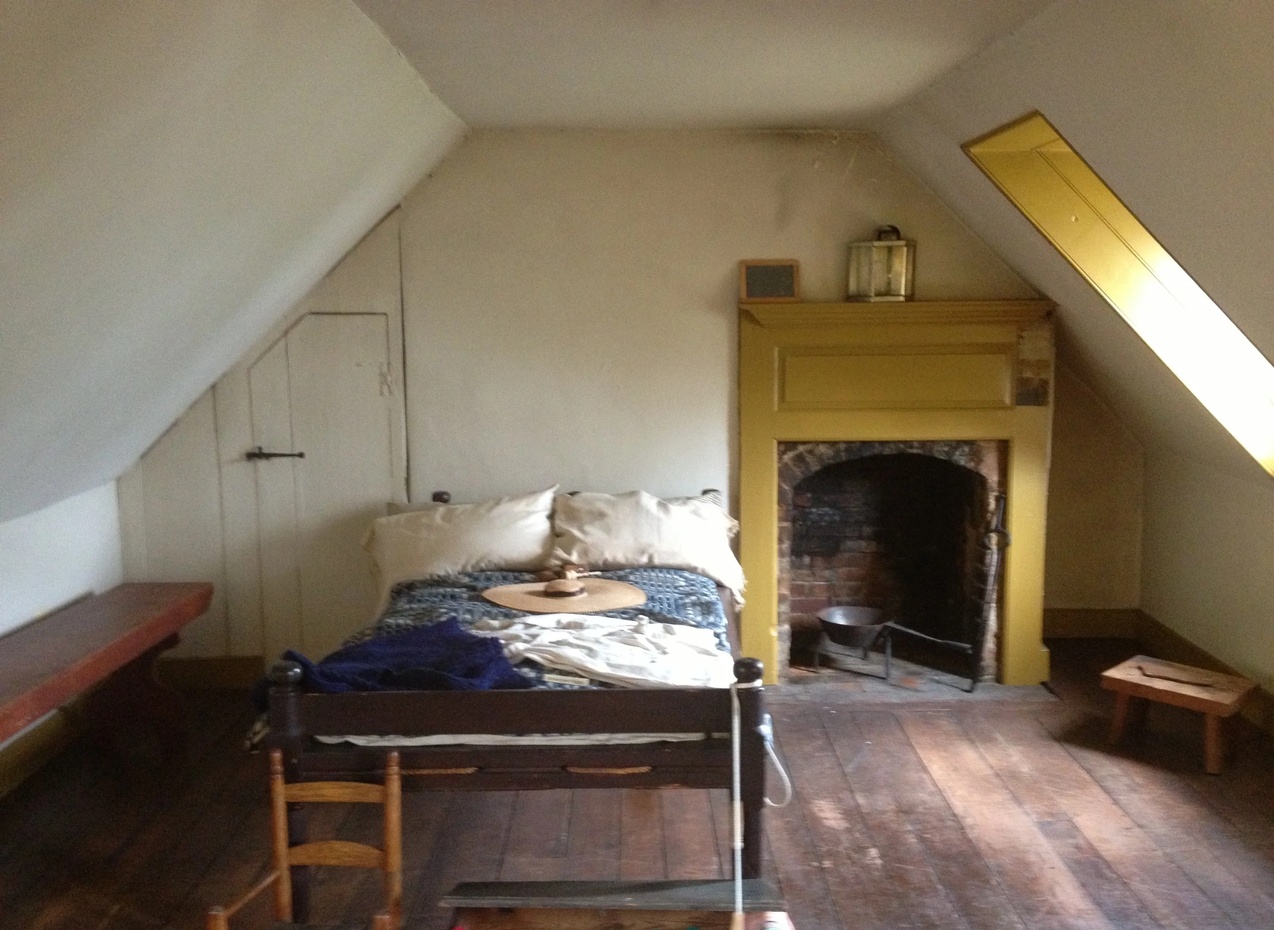
Georgetown Historical House Bedroom
Georgetown Historical Home Washington, DC showing the simple lines of an attic room and how someone must have lived in yesteryears.
Georgetown Historical House Bedroom
Georgetown Historical Home Washington, DC showing the simple lines of an attic room and how someone must have lived in yesteryears.
Who else has this gift? The Japanese, Shakers and the great Danes show a respect for the materials and its function than for the flare of the line.
If your place has good bones, it doesn’t need much.
GOING GREEN: THE ENVIRONMENT AND THE COST
Green isn’t just a name for money. It’s meaning has come to embrace being thoughtful about how we impact our environment and how we may cut back on wasteful purchases.
Did you know the ubiquitous lush, green seeded lawns we take for granted in the United States have their origin in the estates of English countryside? England - a place where the weather is drizzly, moist and overcast most of the year. Yet, in the US we imported this lawn look – lock, stock and barrel all the way from the Northeast to Arizona (think desert) and every suburb in between. How impractical! And did I mention the weed killers it takes to keep these lawns looking as lush as their English counterparts?
In the US we are not as bound to using our surrounding materials as are many indigenous cultures. Nor are we as restricted by our weather due to the relatively recent innovations of refrigeration and air conditioning as well as heating, we can live indoors in climate-controlled environments year round.
Yet, with these boundless luxuries, we are quickly coming to understand that any manipulation of nature comes at a very high cost – is that where the green comes from (wink)? Daily we are faced with decisions based upon the imprint we are making on our overly taxed, overly populated and very fragile green planet.
For the last 2-3 generations, a plethora of new clothes, furnishings, housing and cars have boosted our economy with the advent of the industrial revolution (while we in the US were producing the goods – but that’s another story).
Our barometer of how well we were doing while mass producing items added to our personal sense of accomplishment. Now we know there is a non-refundable price we have to pay for all the excess. It’s ripple effect can be seen not only in the natural world of resources but also in the very air we breath.
How shocked I was when I learned that in India women wear their sari in the Ganges River to wash because it is the only garment they own. Similarly, our early settlers, the forefathers of this country, possessed double the amount of garments, 2. One was their work outfit and the other their ‘Sunday best’. Growing up insulated in post WWII America with nouveau riche parents these were scenarios I never confronted and had no idea existed...pre-internet. We slowly came to embraced not only the information highway Al Gore touted but also his environmental stance.
As sobering as our reality may be, shattering the dreams from the baby boomers to the millennials, I am grateful we can never go back to the waste of yesterday when we absent mindedly disregarded the slightly worn for the shiny new. We are now in the midst of a movement that leads us back, full circle, to a more rustic and humble past - our new beginning.
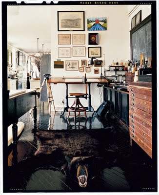
Can we, as humbler people of past generations have, be grateful for what we possess, no matter the size? Can we see that the old patina has a richness from age that we can never reproduce? Not only does keeping our well-worn objects with their time-accumulated character, assume a smaller footprint, it has become the right thing to do - minus the bear rug?

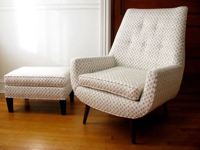
Marc Zeff couch with orange piping
WHAT DO I DO WITH OUR COUCH?
Marc Zeff couch with orange piping
WHAT DO I DO WITH OUR COUCH?
MET HOME MAGAZINE Nov/Dec 1996 Grey Crawford/photo Linda O’Keefe/text
Taking a good look at that larger than 'us' object that sits in the middle of our living room, what are our options? If you already own one does it pay to keep it? If so, what it may take to save it. Consider first where you'll put it by measuring both the couch and the space. If it works, does it need a little sprucing up: maybe some different pillows.
If it needs more, we have to ask ourselves if the couch has good bones - meaning a good enough stuffing and/or springs that are worth saving? Is the frame and line of the couch in good shape? Is investing in reupholstering it with new fillers such as foam or down and new fabric worth it? (see photos where Kelly Wearstler did just that) Next comes the choice of fabric including texture, color, piping and/or tufted buttons. Buttons and piping in a contrasting color can make the room as shown in the above photo by the interior designer Mark Zeff . All of our decisions are based on how they enhance the story of the overall room. Considerations are if there will be pets, babies or young children bouncing and drooling on it?
After weighing these options with a professional upholsterer who will be altering the couch and pricing the cost of repair, we then have to weigh our options and decide if the space is better served by saving something or buying new. And if so, what and where to buy? Used or new, etc….?
MET HOME was a publication, now defunct, that dedicated an issue in 1996 to their pick of rising stars in design. Kelly Wearstler was one of them. Her career is now better known for designing grand hotels and even grander homes. But this magazine highlights her early efforts and her ability to work with the room as if it was a piece of sculpture. The rooms highlight her wonderful use of color and form. They also highlight her brilliance as she tweaks a piece of mid century furniture by changing it’s upholstered shape and fabric to make it relevant to the space and time we live in. How audacious…truly a risen star!
THE WELL WORN AND THE, well...NOT SO WELL WORN (De-stress-ing)
I have recently seen a shabby chic look try to imitate well worn. It has been taken to a trendy extreme as a source for profit. Isn’t this so the antithesis of what it was meant to be? It is rather (de-stress)ful to see faux-distressed new furniture popping up, like a craze to create the ready-made lived-in look.
Cheap fakes cry out, “I don’t have character, but please think I do”.
Isn’t it the character that evolves over time on objects what we love to see? Dare we have the patience to wait, instead of succumbing to the contrived? And if we can’t wait, can we find that well-worn object at a flea market, vintage store or charity shop?
I’ve been told ABC Carpet and Home layers their already old columns - stressing them to look a certain ‘old’. With the store’s expert craftsmen, it is difficult to tell the difference. When expert craftsmen in an historical restoration need to make new wood panels, wall boards or floor boards to replace the old that are beyond repair, they stress them to match the old.
Unfortunately, during the mounting excess that reached a crescendo in the 80’s, many of our fine old rooms and houses were torn down or renovated at the cost of losing their inherent beauty. It seems that once we reject something for long enough and when that thing starts to become scarce and irreplaceable (think vinyl, typewriters and old phones) we become nostalgic for it. Vintage harkens back to an age when life seemed less complicated. Surrounding ourselves with vintage is like eating a comfort food for the eyes. The eyes as mentioned in Scale being an extension of the brain.
Post WWII brought about the innovation of new ways of handling and inventing synthetic material for various purposes – our new dwellings, landing on the moon and innovating fashion such as when nylon stockings replaced silk due to a shortage of the material.

Private home of I.M. Pei and Mies Van der Rohe
LIVE AS I SAY… NOT AS I DO
2 Giants who shaped modern architecture by spearheading the steel and glass post WWII skyscraper movement dwelled in quaint old style homes. Who could these giants be?
Private home of I.M. Pei and Mies Van der Rohe
LIVE AS I SAY… NOT AS I DO
2 Giants who shaped modern architecture by spearheading the steel and glass post WWII skyscraper movement dwelled in quaint old style homes. Who could these giants be?
The first image above shows the street I.M. Pei lives on - SUTTON PLACE townhouse row, one of the most quaint and exclusive neighborhoods in all of New York City. The second image shows Mies van der Rohe sitting in his dining room. Complete with chair rail and wall molding. How quaint.
Introduced and spearheaded by Mies van der Rohe and the Bauhaus School of Art in the early part of the 20th century, these new approaches to building materials heralded a new age in architecture. The steel columns and beams used in construction changed skylines and opened each room to greater expanses of glass than ever known before. Almost overnight we went from using multiple small window panes to having a floor to ceiling glass expanse called a curtain wall. The increase in light entering the building must have been awe inspiring during the transition - think Mad Men.
A not so well known fact is that Mies van der Rohe and I.M. Pei, world renowned pillars of modern architecture; who shaped the design of steel and glass office skyscrapers as well as high-rise luxury apartment buildings of the 20th century, chose to live in prewar, charming, older dwellings! These men who could live anywhere, choose to make their homes in these charming low storied dwellings.
My friend Lenore Tawney told me she knew Mies van der Rohe when they both lived in Chicago. She said, “He built two glass apartment complexes on Lake Shore Drive but he himself chose to live in an older low story apartment building. One block from me on Cedar, called Elm. That says a lot, doesn't it?" She laughed. Even the names of the streets conjure visions of a pastoral setting.
If they can live with the old, why not we?

