


sunrise hopi song
The dark purple light rises in the north,
A yellow light rises in the east.
Then we of the flowers of the earth come
To receive a long life of joy.
We call ourselves the Butterfly Maidens.
~ Hopi, Native American Tribe Song of Creation
sunrise hopi song
The dark purple light rises in the north,
A yellow light rises in the east.
Then we of the flowers of the earth come
To receive a long life of joy.
We call ourselves the Butterfly Maidens.
~ Hopi, Native American Tribe Song of Creation
Monet at Giverny
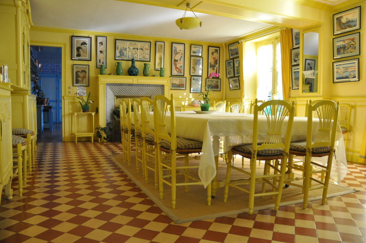
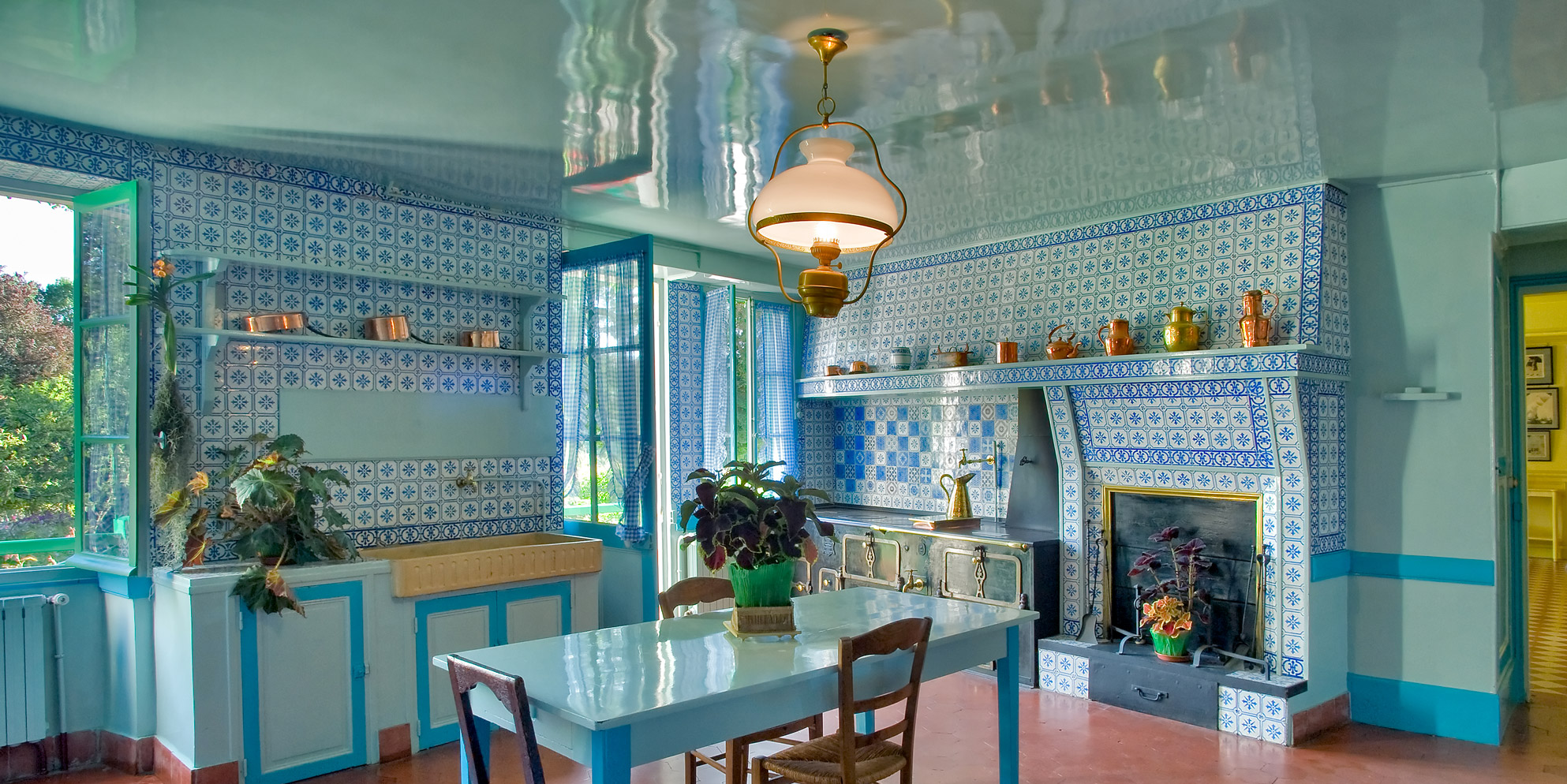
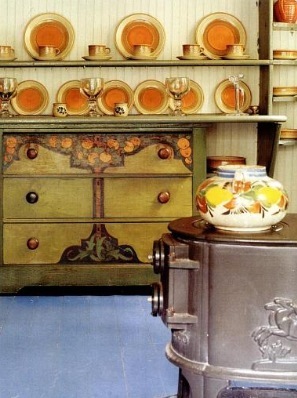
Visiting Monet's house and gardens at Giverny, among the many things I was moved by were his dining room and kitchen. I think this was because of his color choices. In his dining room, the stronger buttery yellows played off the creamy yellow colors, finely tuned to the rich hue of terra-cotta floor tiles found on the floor. The walls with their stockpile of Japanese woodblock prints brought in accents of just the right shades of indigo blue. In the kitchen, delft blue tiles were the backdrop to just the right turquoise accents in the furniture sitting on a long expanse of cinnabar flooring. Th symphony of colors showed themselves without looking studied or out of sync - as if they had been there forever.
COLOR HEALS
There is a crossover between light, color, and how they affect our mood. How different our mood on a sunny day vs. a rainy day. Studies have shown that color affects our happiness. AND color heals. Therefore COLOR, should be one of the first things we consider in a room. Never should we think of it as an afterthought.
BEFORE SYNTHETIC DYES THERE WERE NATURAL DYES + PIGMENTS
NATURAL DYES

“How did ‘natural’ ever come to mean earth toned? Consider this: natural dyes have been used to make many of the world’s most beautiful textiles, including the unicorn tapestries, the Persian carpets that decorated Versailles, the suit worn by Gainsborough’s blue boy, and the red and blue of the first American flag. They are hidden among us, in lichens and mushrooms, within leaves, roots, and bark. They’re trapped in insect bodies; enfolded within mollusk shells. Natural dyes are everywhere….”
~Celia Barbour
Here are a few examples of rich natural dyes…and naturally harmonious color combinations.
The color the dye produces is affected by the material dyed as well as the mordant used to fix or stabilize the dye.
The relatively new man-made or synthetic dyes revolutionized color. These first aniline dye were accidentally discovered from coal tar, the residue of burning coal from both heating and illuminating. In the 1880’s, before the big push by Edison for electricity, coal was the preferred illumination.
While Nikola Tesla was exploring how to harness lightening as a renewable and free electrical energy, Thomas Edison was turning it into a commodity the consumer would pay for. Electricity was invented in 1802 but not until 1878 when Edison stepped in and fortunes could be made, did it take hold. As the cost decreased in the early 1900’s electricity became the preferred source of illumination.
The twin inventions, synthetic dyes (1856) and electric light bulbs – revolutionized not only our consumer clothing and work life but also our interiors.
Today we take this all for granted - from the flip of a switch to the flush of a toilet. But back then during these transformative years it must have felt exhilarating.
eyes of the beholder
color
is
in the eye of the beholder
eyes of the beholder
color
is
in the eye of the beholder
Color is not only subjective to the light that surrounds it but to the view’s perception. This has lead me to believe there is no absolute color.
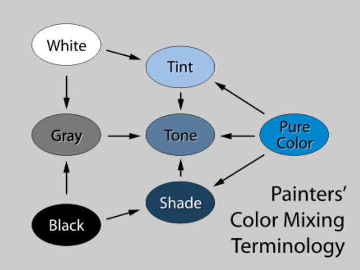
Dark colors use the addition of black and are called shades. They are light absorbers. Light colors on the other hand, because of the addition of white are tints. They reflect light back to us. Always the color we see is the color that the light has not absorbed. The color we are looking at is the color reflected back to us.
There is no absolute color or light condition. It is what the viewer brings to the experience that makes it interactive. This is our sacred connection.
When we are seeing color in various types of natural light or through a variety of electric bulbs – it changes. This is because the light is picking up different ends of the color spectrum.
This shows just how subjective light perception is. And if the receiver is color blind (brain/eye perception) then the person’s range of color receptors are narrower than those who see a wider (but never full) range of the spectrum. Who’s to say which is correct?
L’Wren Scott said in an interview with Vogue magazine about choosing paint colors “…seeing what looked good on bright days, wintry days, in summer, at night.”
greek goddesses
An artist’s depiction of how the Siphnians at Delphi looked when it was built over 2,500 years ago. How the Caryatids look today.
greek goddesses
An artist’s depiction of how the Siphnians at Delphi looked when it was built over 2,500 years ago. How the Caryatids look today.
“It wasn’t until the mid-nineteenth century that scholars began to realize there were no white surfaces on the classical Greek buildings we know today as white. When originally built, Doric columns were striped red and blue and the Ionic capitals sported gold. In the mid-nineteen century hundreds these findings were not welcomed. The sculptor Auguste Rodin famously beat his chest exclaiming: ‘I feel here that they were never colored,’ he proclaimed passionately.”
COLOR ~Victoria Finlay
Mr. Rodin’s preference was ‘colored’ by his cherished belief of how ancient sculpture looks today and he couldn't let go of it.
WHEN COLOR SINGS
Does a bad exist? I don’t believe so. Only bad combinations of color can make them appear inharmonious. Any color, among the right combination of colors, can have a pleasing effect.
Candice Wheeler Decor Arts Now Lynn Bryne
It’s easy to get jazzed about color when we hit upon those right combinations. But how? One way is to make a simple paint box of these “right” colors. It can be a family activity to take paint chips or magazine cuts and put them in 2 piles. One pile consists of the selection of colors you each love and the other pile, those you don’t feel that way about. See if you can find colors from each pile that work together. These colors can then be saved to reference you or your children’s room color combinations. If you bring them to a specific room you can watch how the light changes them. Then if you decide it doesn’t look good in the setting you can simply pick others that do.
There are 3 elements when deciding which colors to use for a particular room: consider the natural light of each room (or lack of), consider how you will light the room in the evening or on overcast days, establish the function of each room.
Before painting that favorite color in a whole room, buy a small sample of this color and paint a small section of the wall. It might surprise you to see how the light hits it on a vertical surface…and the changes the color takes on depending upon the various light factors. You might need to adjust the hue (color), intensity (bright to dull) or value (light to dark) before you invest in painting the whole room. This test is well worth its investment. Paint stores are happy to sell you small sample cans just for this purpose.
Move the color around the room to different areas to see the color change it’s shade (darker) and tint (lighter) depending upon where it’s placed.
Candace Wheeler in her book, Principles of Design from the 1920’s said, “the number, size and placing of the windows will greatly affect the intensity of color to be used. It must always be remembered that any interior is dark as compared with out-of-doors, and that in the lightest room there will be dark corners or spaces where the color chosen as chief tint will seem much darker than it really is. A paper or textile chosen in a good light will look several shades darker when placed in large unbroken masses or spaces upon the wall, and a fully furnished room will generally be much darker when completed than might be expected in planning it.
“For this reason, in choosing a favorite tint, it is better on many accounts to choose it in as light a shade as one finds agreeable. It can be repeated in stronger tones in furniture or in small and unimportant furnishings of the room, but the wall tone should never be deeper than medium in strength, at the risk of having all the light absorbed by the color, and of losing a sense of atmosphere in the room. There is another reason for this, which is that many colors are agreeable, even to their lovers, only in light tones. The moment they get below medium they become insistent, and make themselves of too much importance.”
Even though Candice Wheeler spoke truthfully for her time, she was speaking before new construction through floor to ceiling windows or the fierce amount of electricity we use today allowed for light to flood into the room. Nevertheless, her observations are still applicable.
What does the color spectrum looks like?
The Color Wheel
THE COLOR WHEEL
The Color Wheel
THE COLOR WHEEL
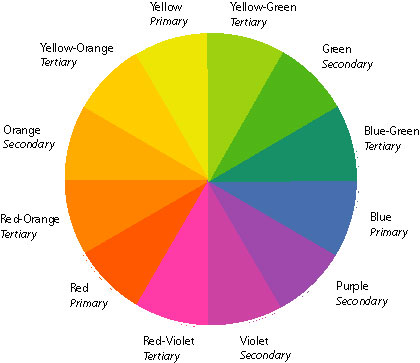
There are analogous colors that are close to each other on the color wheel. Then there are those colors opposite to each other on the color wheel which we call complimentary.

rainbow RS Candice Wheeler
The only 2 times I can think of when the naked eye sees the full color spectrum is when looking through a prism or when a rainbow appears after a rain shower.
rainbow RS Candice Wheeler
The only 2 times I can think of when the naked eye sees the full color spectrum is when looking through a prism or when a rainbow appears after a rain shower.
what do chinatown, Joseph Hoffman and Frank Lloyd Wright have in common?
Rudolph Shaeffer.
WHo???
Rudolph Schaeffer (1886-1988) a founder of the California Arts and Crafts Movement was my teacher and mentor in the 1980’s. He created one of the most distinctive and successful schools of color and design, The Rudolph Schaeffer School of Design. He had visits from the likes of Frank Lloyd Wright. He had a profound impact on everyone within his sphere of influence and was himself influence by a visit to Joseph Hoffman and the Bauhaus school. He was also transformed by the art and philosophy that sprang up in the early days of S.F.'s Chinatown. He delved into our modern study of color and its effect on human psychology. He imbued all he talked about with a spiritual flavor that issued from the depth of his being.
He believed, "we have to delve into the secrets of color. The reason color study is so important is because color is differentiated light and we cannot live without light." Even his critics admitted, "he spent the better part of a century teaching San Franciscans to make their city, their homes, their gardens, and their lives more harmonious, more beautiful, and hence more human." http://www.thediviningnation.com/beauty.htm

Mr Schaeffer, as we came to call him (or Rudy when he wasn't present), taught us to use a variation of the value (white or black added to color) or intensity (brightness) of the same or analogous color.
He also taught us to bring together colors of the opposite extreme in value - such as purple and yellow: complimentary colors. But he cautioned not to evenly match the intervals (or quantity) of the differences. By introducing a small amount of one or the other related color, this would pull the ensemble together in harmony. At the same time, he recommended bringing a third element closer to one color or the opposite. By doing this, he explained that you keep the interest…and the harmony with just the right amount of tension. This forces eye circulation in a way that is not jarring. (SCALE/PROPORTION/VOLUME Eye Circulation)
How I keep these 3 steps in mind:
1. Select one color
2. Variation of one or the other color in tint or shade.
3. Select opposing color – which does not have to be complimentary.
This polarity and integration of the 2 modes sets up the harmony and rhythm.

Décor Arts Now, Lynn Bryne
Candice Wheeler's home and others which she had a hand in designing are part of the Onteora community (right) that still exists today. There is also a wonderful example of her work at the Park Ave Armory, NYC. She was a part of the Tiffany Associates Studios. She was a friend of Mark Twain and some of her textiles are in his home in Hartford Connecticut, a museum today.
She used the colors yellow, white and blue to cheer up a room: “With the use of yellow (upper halves of the windows of semi-opaque yellow glass, veined and variable below these thin yellow silk curtains cross each other so the whole window-space radiates yellow light) and white (5’ wainscot of small square panels painted a glittering varnished white which is warm in tone, but not creamy) accented with touches of blue (at intervals along the wall above wainscoting are watercolors of Holland meadows, or blue canals balanced on either side by a blue delft plate and in a corner near the window is a blue porcelain stove) which converts a dark and perfectly cheerless room into a glitter of light and warmth.”
No photo exists for this interior described above outside of what our imagination can conjure.
What emerges in both Wheeler and Monet’s kitchens is their ability to create magic with color. They know exactly how colors play off one another and they are not afraid to play with them. This is not out of reach to any of us if we look with an inquisitive mind and keenly observe.
Reflective surfaces
Surfaces Reflect (and ABSORB) LIGHT
Reflective surfaces
Surfaces Reflect (and ABSORB) LIGHT
The color and light coming from a surface bounce back onto our retina. The retina is an incredible little devise at the back of our eyeballs. They contain cells which are sensitive to light. This light activity triggers nerve impulses which pass to the optic nerve in the brain, where a visual image is then formed.
In low lit rooms, one way to enhance the reflection coming from surfaces is to hang a chandelier from the ceiling. A good designer - such as you and I - can deftly bounce the light and color around a room by literally integrating the principles outlined here on color and in illumination. One designer who nailed this concept was ROSE CUMMINGS, a daring grande dame of interior design.
book quote COLOR, Kara Mann, Candice landscape
“…I have found with so many of the most valuable colors I have gone looking for – especially sacred ochre in Australia, but also the best reds and the velvety blacks and, of course, that precious metal gold – one of the most important elements of their appeal is the way they have shone. It has somehow lifted a color or a substance from the level of secular to sacred – as if, by reflecting back some of the pure light of the universe, it embodies something holy. Or wholly powerful, at least.”
~Victoria Finlay, COLOR
If our goal is to make our rooms restful, using similar or analogous colors in their lighter or darker values on furniture and objects will achieve this.
Kara Mann's interior featured in Traditional Home Magazine shows this.

Candace Wheeler observed that the room is like a landscape in color. As in nature she said, it is important to make the floor the darkest (earth), the walls the middle value (greenery) and the ceiling the lightest (sky). She said if you reverse these colors and make the ceiling the darkest color and the floors the lightest, the room will not feel spacious and might even feel disorienting.
This church in Copenhagen must have been listening to Candace from across the ocean.
At the MET their rooms of antiquity exemplify colors that belong to landscape.
Here's a room that would have taken Wheeler literally by painting images of trees on the walls.
Lorillard Mansion board room, 1916