


Snowbirds, JK
Yellow cabs + SnowBird truck with the remains of a light dusting of overnight snow whizzing by my window
~Winter 2015
Snowbirds, JK
Yellow cabs + SnowBird truck with the remains of a light dusting of overnight snow whizzing by my window
~Winter 2015
I began to wonder if “landscaped” color discussed in the previous section is relevant today or if it’s become an outdated concept. What I found is that we have come to expect even bolder statements of color in our rooms augmented by light flooding in post WWII construction, a variety of artificial (electric) lighting and artificial (aniline) pigments.
Though there’s recently been a more eclectic approach to design, which includes earthy tones and less plastic forms than in the 60’s, courageous color is still a key to bringing disparate elements into unison. Whether earthy, bold or a combination of both, we all want to live with the right color notes. Like a symphony playing in the background of our lives.
60's "hopeful" furniture
I once asked a client of mine who has become a friend why she collected some of the most iconic furniture pieces of the 60’s. She said she collected them because it was a hopeful era, a time when people were looking to the future and seeing infinite possibilities. (Moon landings anyone?)
Her pieces reflect fiercely bold colors with lines that don’t cry old world Biedermeier and Chippendale but are ‘futuristic’ in shape.
Jenette Kahn, In Your Space
The pieces she bought at auction are collectibles. But over time one of the couches synthetic foam began to disintegrate. It had been filled with what was then new - a polyurethane foam. No one had any idea of its ‘shelf life’.
Something to consider when buying used furniture is to know what the piece is made of on the inside. We buy what we love, without realizing it may have structural shortcomings.
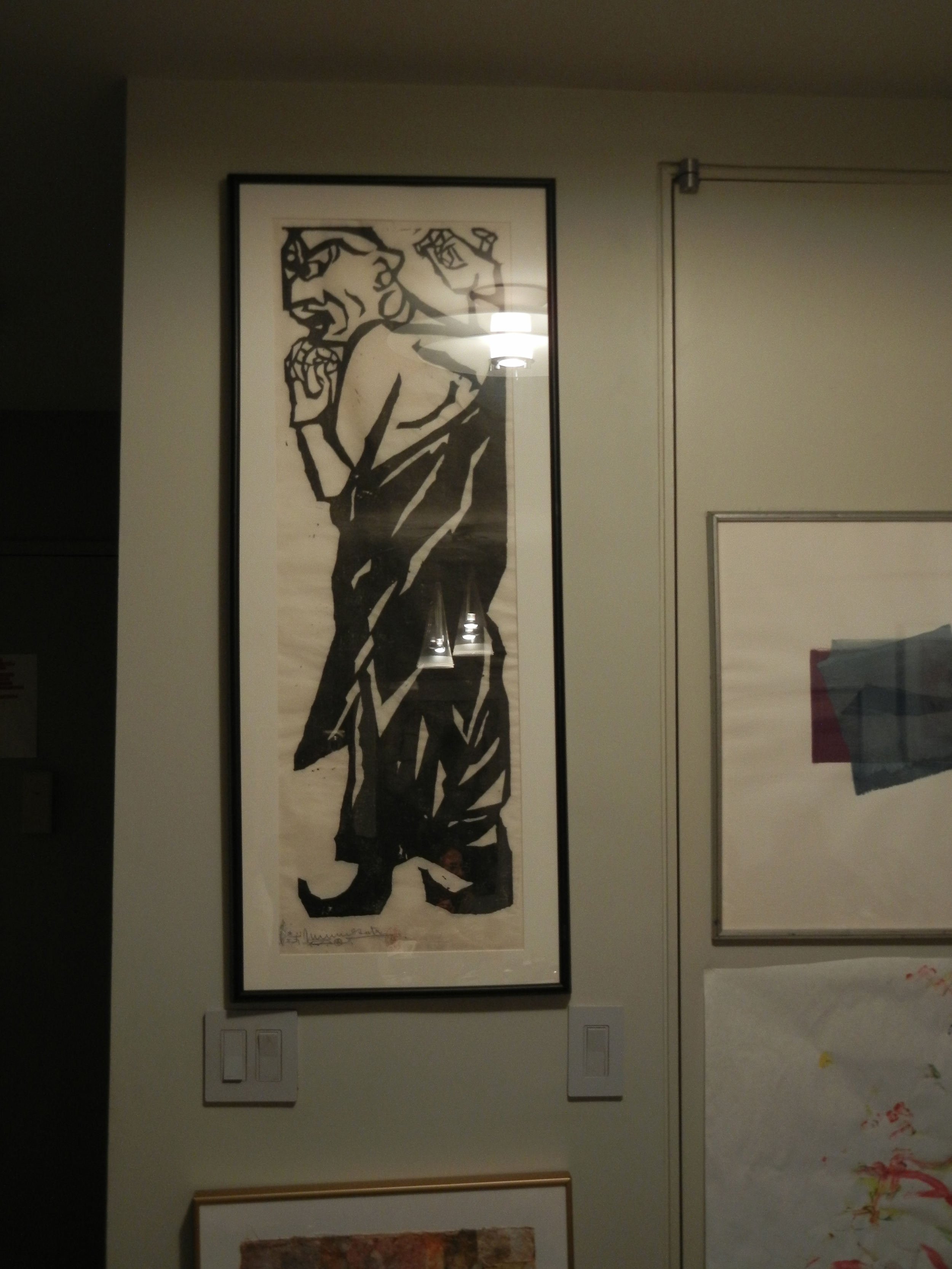
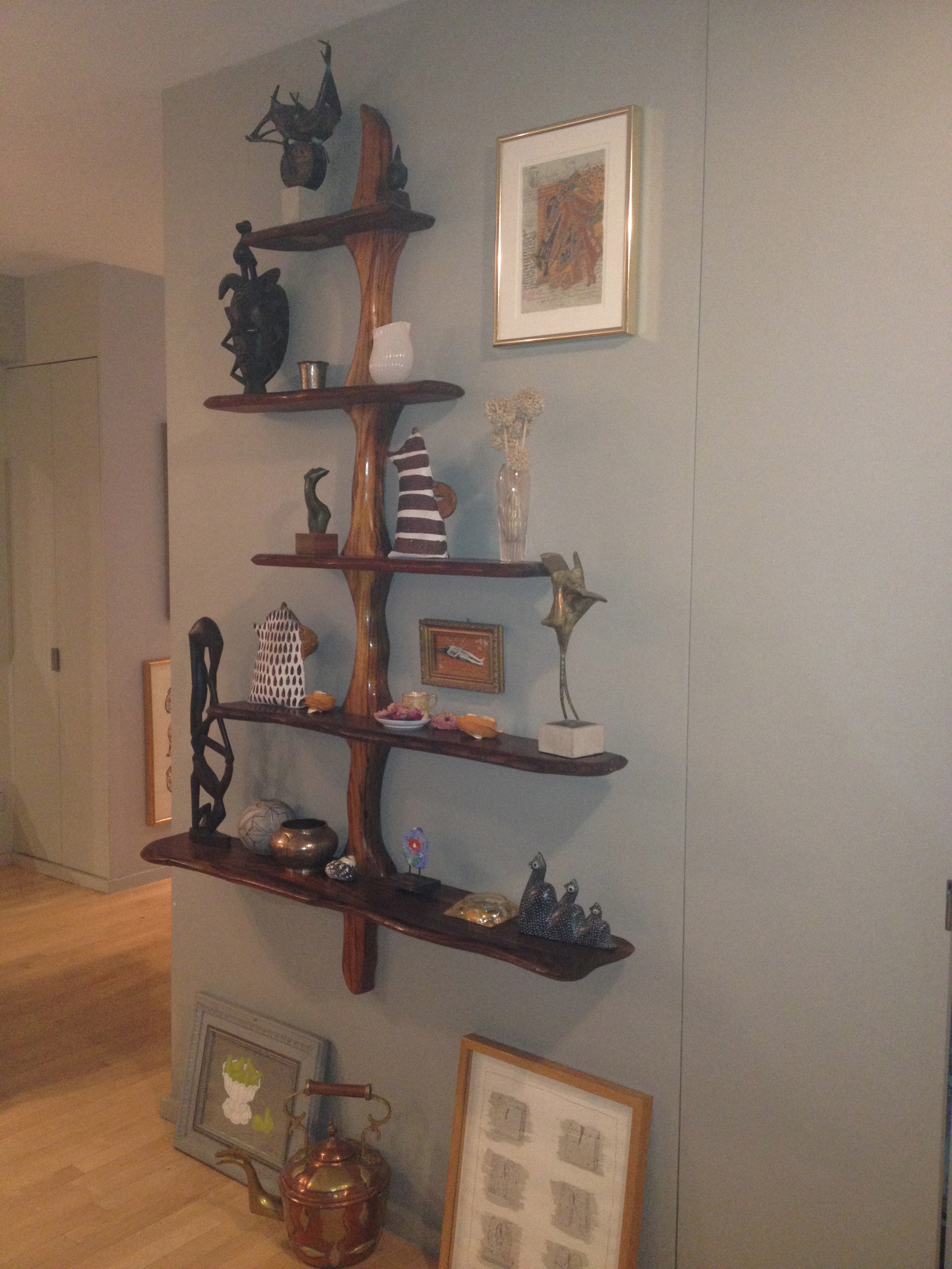
Whether we like a bold or subdued color palette, we can play with peppering the floor, ceiling, furniture or artwork with bold accents. If we want a colorful piece of furniture to stand out, then it’s fun to paint furniture what we already have or a flea market find that might be old, stained or chipped. We can give it a coat of our 'must have' color. If not on the furniture how about placing a large block of color on one of the walls. Extra awall color and attention can be gotten from wallpapering or placing a painting on it. If we keep the walls, ceiling and floor as a neutral backdrop it nicely counter-balances the piece of artwork that pops to center stage.
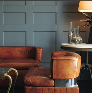
When Color Sings D’Aquino Monaco Design Credit Trevor Tondro for The New York Times
When Color Sings
When Color Sings D’Aquino Monaco Design Credit Trevor Tondro for The New York Times
When Color Sings

D'AquinoMonaco/Trevor Tondro for The New York Times 2010
Rees Roberts Interior
Soothing colors with ambient and task lighting in a bedroom designed by Rees Roberts. The artwork lends a touch of color.
Rees Roberts Interior
Soothing colors with ambient and task lighting in a bedroom designed by Rees Roberts. The artwork lends a touch of color.
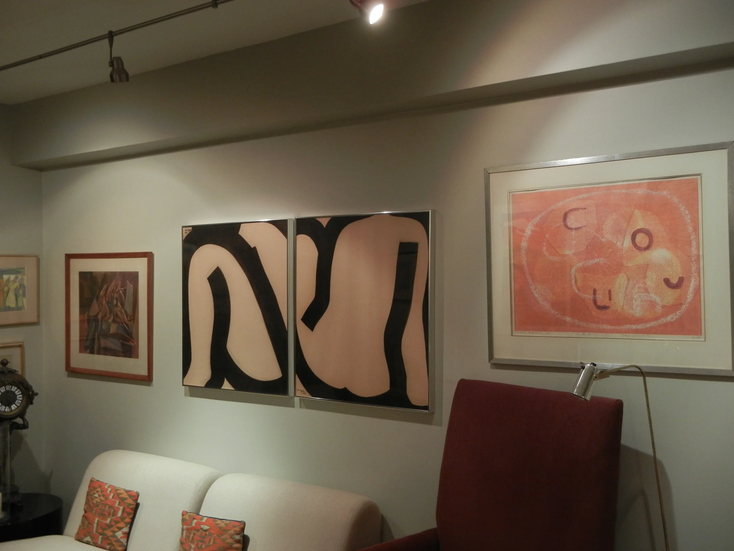
Several years ago, when first I saw the colors on the walls that my friends’ mother’s interior designer had chosen, I was sure this designer had made a huge mistake. The color was a variety of mid-tone dove grey. As I was asked to help select and hang the paintings from her art collection. I soon realized how wrong I was!
There wasn’t a painting that did not go well with this neutral color. Each of the grey colors used on the walls varied slightly from room to room. They perfectly highlighted the paintings with their clustering of frames sometimes butting up to each other - creating a riot of color and form on the walls. The track fixtures on the ceilings made perfect sense as we could adjust the angle at which they highlighted the artwork.
rest of Fredy
rest of Fredy
When Houzz touted deVol’s mushroom paint, Spring Thaw from Benjamin Moore and Elephant’s Breath from Farrow & Ball I knew all those grayed down colors would make a perfect backdrop!
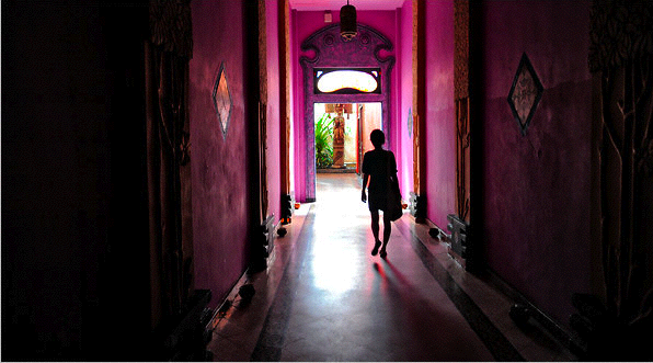
Morocco
A room’s light and color affects our mood. We are immersed in it on all 4 sides.
~
Morocco seems to be about light, architecture and color.
Morocco
A room’s light and color affects our mood. We are immersed in it on all 4 sides.
~
Morocco seems to be about light, architecture and color.
Overcast vs Sunny Days
Have you ever noticed that on overcast days colors look and seem more vibrant than on sunny days? This is because on those sunny days the sun’s rays compete with the shadows it casts. In the Northern Hemisphere, northern light is a softer more diffused light than southern light because it is further from the equator. This has to do with the tilt of the earth’s axis when it rotates around the sun.
Artists prefer to paint with northern light because Northern exposure (light coming from a north window) is not only softer but it also stays more constant throughout the day. (Illumination - tilt of earth)
Candace Wheeler must have been a keen observer because in her book, Principles of Home Decoration, written over a century ago, she suggests using reds and yellows in a room with not very good exposure to the sun and staying with blues and greens where there is stronger exposure. This goes back to the slant of the sun’s rays.
Wheeler talks about transforming a dark area into a light and cheerful one by making the walls and floors gold or yellow colored. Which coincidentally happens to be the very same color we attribute to the sun. She suggests using more of the yellow, white and oranges in these low lit rooms. How different dark these rooms must have seemed after sundown as compared to our electrically lit options today!
Her book was written at a time when there was electricity in the home but the variety of incandescent light was not nearly as developed. The words florescent, halogen and LED’s only existed in a very distant future.
This information may not be as relevant to a modern suburban home, but in city dwellings where height of the apartment and the exposures we face will determine the amount of light we get to enjoy, it makes perfect sense. Many city dwellers are left in the dark, literally because they live in older homes or older apartments buildings that don’t abound with natural light. Or in the suburbs where homes with hedges or garden growth may obscure the light these color tips may also be relevant and useful.
Chartreuse, shade vs light colors to use
When choosing color for a room it has to work with various light sources.
Chartreuse, shade vs light colors to use
When choosing color for a room it has to work with various light sources.
I then tried to cover the grey color with white and still it didn’t have the original magical effect the chartreuse did. Why? It goes back Candace Wheeler’s color theory and is a confirmation that these choices were right. A yellow color baths the room in a faux sunlight. Once that was lost, the never sunlit apartment became dull. But instead of repainting, a light bulb went off in my head and I decided to place a chartreuse chair by the window. This works!
It is just as important today as back then, to be familiar with the natural light source of each room and to also consider the night luminosity.
After consulting a designer friend and my daughter I switched from a yellow/green chartreuse color for trim around the doors and window ledges to a light dove grey color in a studio with very little direct sunlight. The effect was immediately disappointing.
Blackman Cruz Design
Because the amount of natural light entering our structures has improved and with a dizzying array of electrical light sources, blue has become that soothing color to return to Are we simply mimicking an unconscious memory of a happy feeling in our once natural habitat under a canopy of trees that would shade us from the harsh rays of the sun?
(Blackman Cruz Design)
THE MANY SHADES OF BLUE


In talking about green and blue tones, Wheeler says it’s best to use these shades and tints in well lit rooms with direct sunlight because these colors become too dark, almost black, in the shadow of the north light. She suggests saving these colors for sun lit areas to mitigate the effect of glaring light.
She makes an interesting comment, saying that all shadows and reflection of light are of green and blue and that these colors mimic the outdoor color occurrence of nature. Blues predominate in all it’s intensities and values, and green with all it’s bright and grayed down tones produce a refined and beautiful effect. (In Japanese, the color for green and blue is the same word.) And in Impressionist painting they don't use black, brown or grey for the shadows but rather resort to blues and greens. By so intensely studying nature and the arc of light were they clued into this secret?
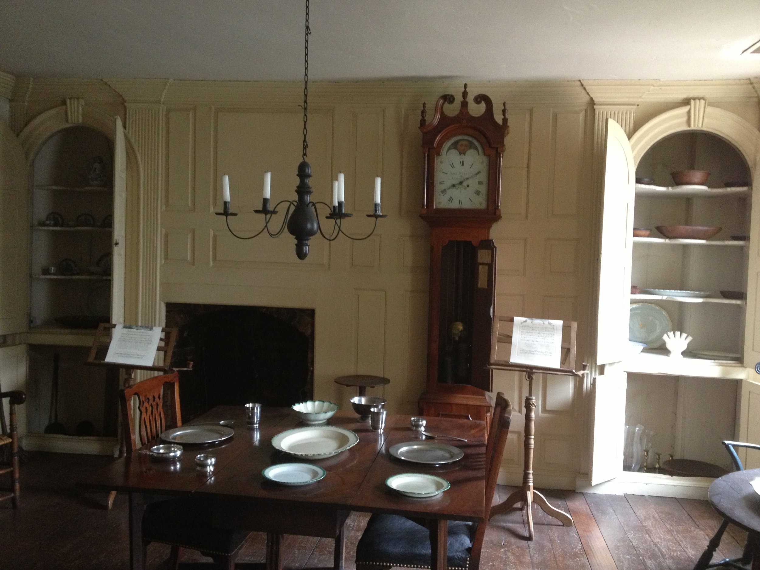
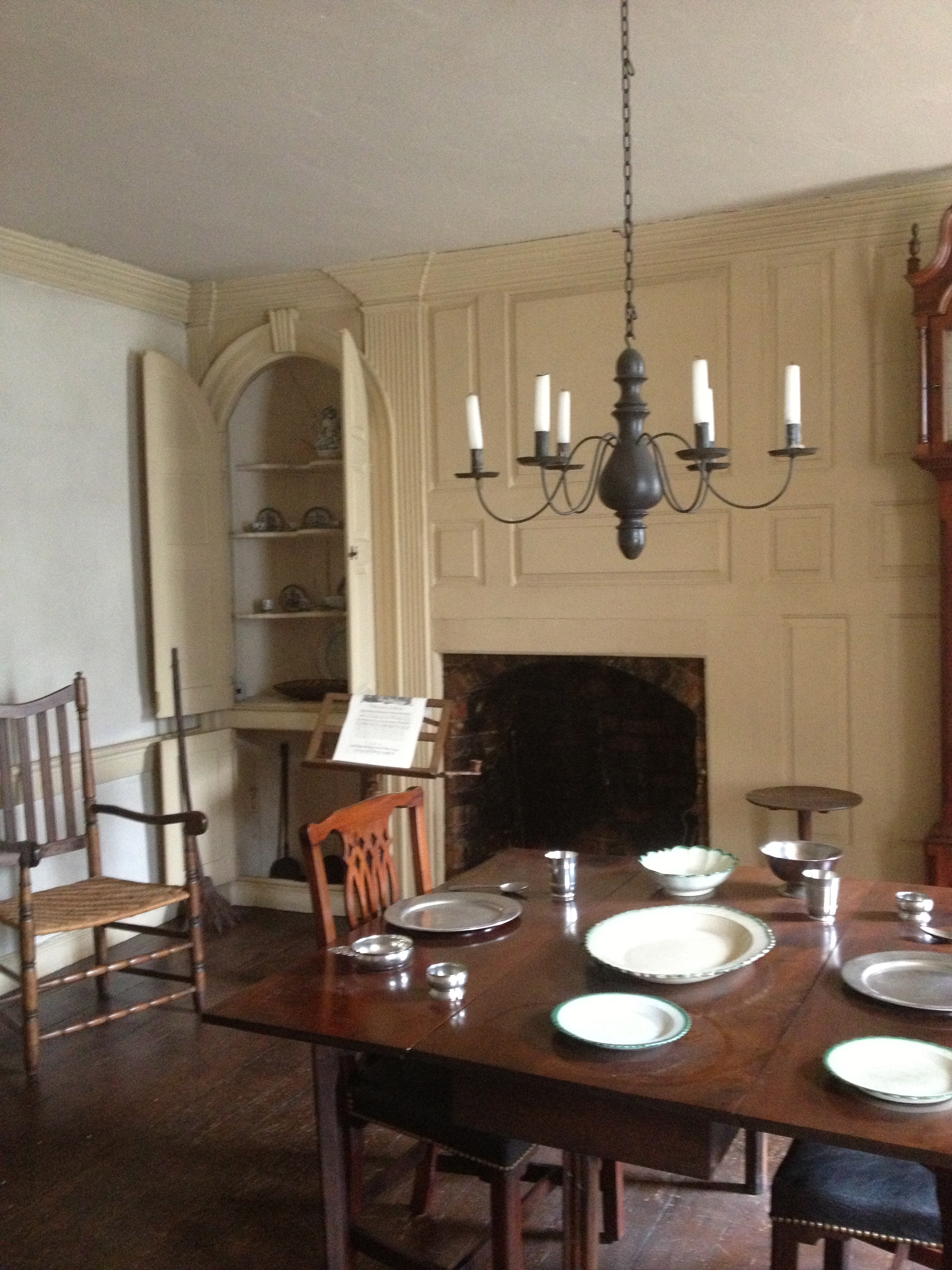
Wyckoff House Brooklyn, NY 1652
Red works well in an area with plenty of light but no sun because it gives the effect of warmth and vitality. Wheeler says that with the change from day to a night light that this color changes from color-tinted darkness to palpitating ruby and even to a flame color. How dramatic! Red seems so versatile – working its magic in both strong light and shadow.
~Wyckoff House Flatbush, Brooklyn 1652
Historical pieces hit just the right note. Cinnabar inside the cabinetry perfectly compliments the blue surface color.
It makes sense to keep dining rooms and bedrooms monochromatic. Our dining area is where the food shines so we don’t need colorful distractions. Giving these rooms a neutral setting lets the color and texture of the meal become the point of interest.
Van Cortland House Stephen Sherman/Photo
Metropolitan Museum Period Room
COLOR COUNTS - Now As Then
The old colonial houses got it right. Natural wood, whitewashed walls and that touch of colonial grey/blue. What could be more peaceful?
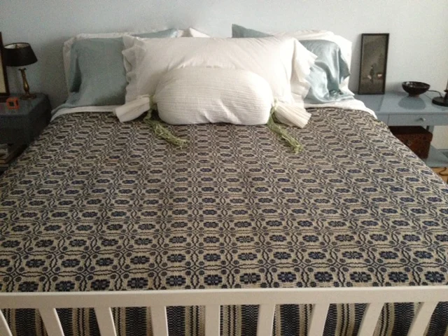
blue bedroom
Our bedroom is our sanctuary. It’s our place of rest and renewal - a place for us to recharge before we re-enter the world again.
Mine is in a symphony of blue
blue bedroom
Our bedroom is our sanctuary. It’s our place of rest and renewal - a place for us to recharge before we re-enter the world again.
Mine is in a symphony of blue
I like to keep my bedroom restful for a good night’s sleep. Until recently I took no electrical devises into the room. This includes TV, computer, even a cell phone. I sometimes cheat on the phone because my business is international and therefore 24/7. But I can happily say I have NEVER put a TV in my room – keeping that particular noise at bay and off limits to my sanctuary. A good, old fashion alarm clock and soothing colors is my creed.
A modern Kitchen looking like 'I've been here forever'.
It makes sense to keep dining rooms and bedrooms monochromatic. Our dining areas are where the food we prepare and eat shines in both its preparation and presentation. So we don’t need colorful statements. Keeping these rooms on the neutral side lets the color and texture of the meal be the point of focus. Yum.
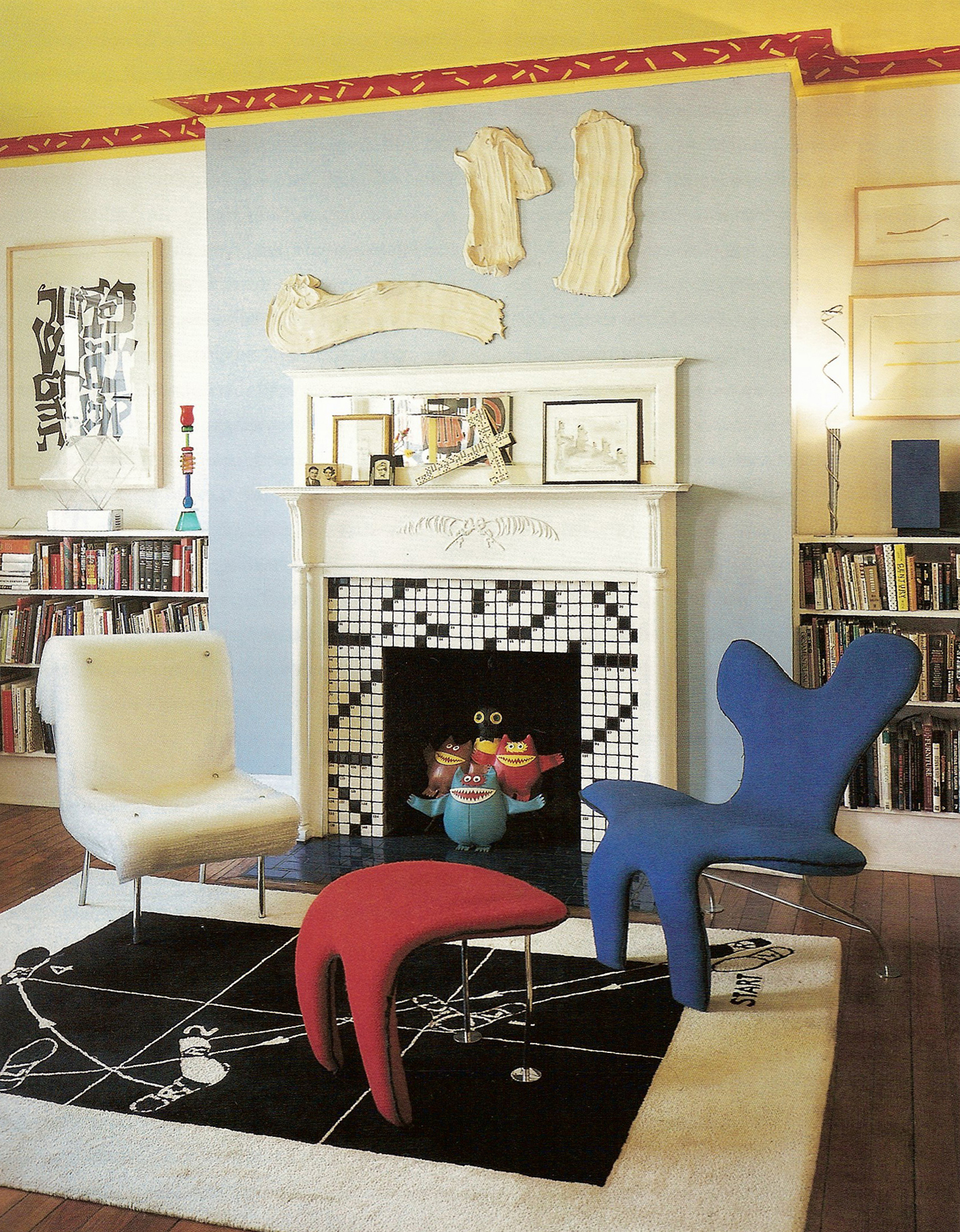
Miles Redd Livingroom Interior
MILES REDD’s interiors hit all the right notes. The book bindings, flowers, fruit bowl and fire are the focal points of color. Oh, and there’s that cinnabar color again – a box on the table.
Miles Redd Livingroom Interior
MILES REDD’s interiors hit all the right notes. The book bindings, flowers, fruit bowl and fire are the focal points of color. Oh, and there’s that cinnabar color again – a box on the table.
I was walking along one of my favorite streets in NYC - maybe because it’s dead ends and forms a "T" - when from across the street I spied a stunningly understated door. This lead my eyes to view the rest of the townhouse mentioning to my daughter, ‘Look at that. Someone actually knows what they’re doing.’ I took some pictures and moved on.
Fast forward to captioning the photographs posted here and I quickly noticed there were quite a few by a particular designer named Miles Redd. I decided to look him up and lo and behold, he lives in that house.
Here are a few more inspiring photographs playing off warm and cool hues. From the gilded rooms at the MET, Blackman Cruz' interior to my present clients, they are using this same greyed blue color on walls, couches, interior headboards and custom carpets, etc.